What Should Be Avoided
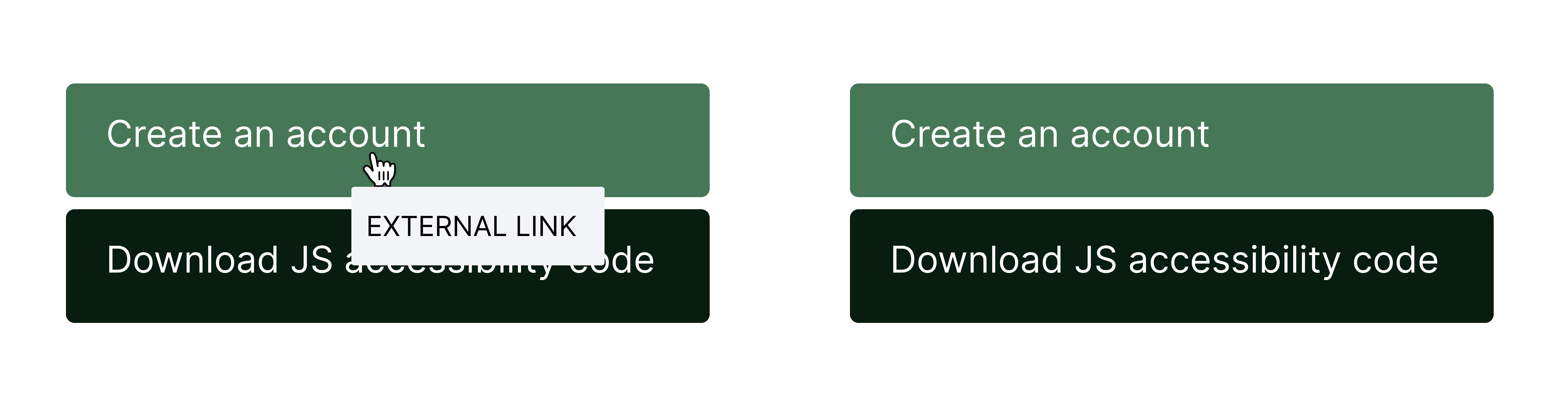
Explanation:Without any mechanism available to dismiss the tooltip, the success criterion is failed, and the tooltip message still remains presented.
Success Criterion 1.4.13 Content on Hover or Focus requires that when additional content becomes visible due to pointer hover or keyboard focus, there must be mechanisms to dismiss, hover over, and ensure persistence of this content. This ensures that users can interact with these elements without losing access to other content.
To ensure that additional content activated by hover or focus adheres to three key principles: dismissibility, hoverability, and persistence.
Provide dismissal method for tooltips: If the tooltip or additional content is not an 'input error', or does not obscure or replace other content on the page, then a method to dismiss additional content that appears on hover or keyboard focus is required. This could involve using the Escape key or a close button.
Ensure tooltip persistence in transitional areas: If additional content is presented, then ensure that the tooltip does not disappear when the hover moves from the trigger to the tooltip, while it's in the transitional area.
Keep content visible until user action: Make sure the content stays visible until the user moves the pointer away from the triggering element or content block, or until the user decides to dismiss it using one of the provided methods.
Exception for "title" tag tooltips: If the tag "title" is used for a tooltip, this means that the practices specified in this criterion do not apply to such content.
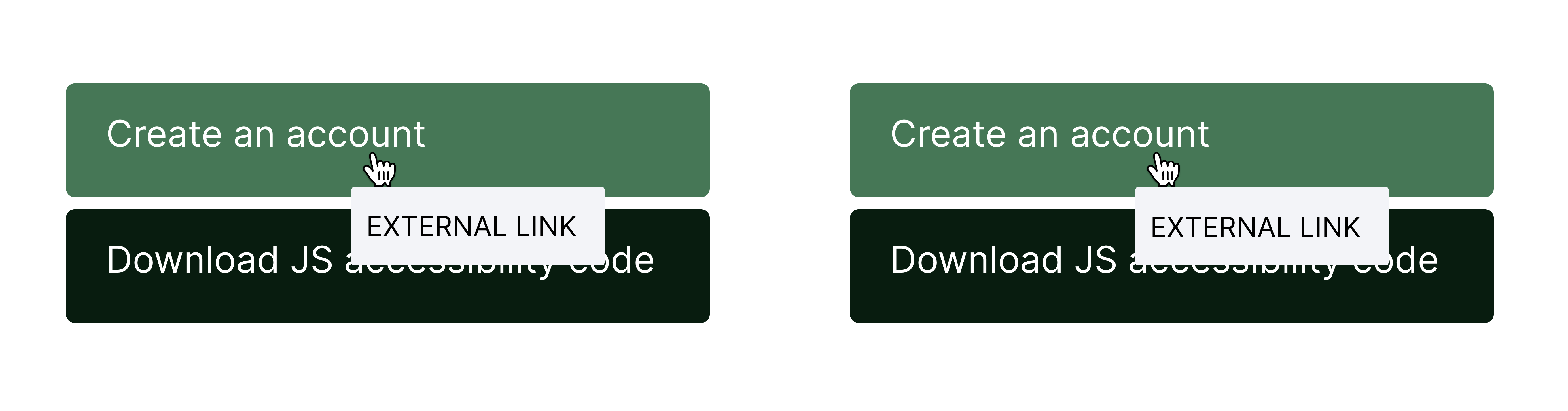
Example 1:Tooltip preview for links
Explanation:Without any mechanism available to dismiss the tooltip, the success criterion is failed, and the tooltip message still remains presented.
Explanation:In this case, once the user hovers over the 'create an account' link, the tooltip pops up and blocks the text of the button located underneath. However, the user can dismiss the tooltip by clicking on the ESCAPE key.