FREE
INSTANT WCAG · ADA · EAA AUDIT
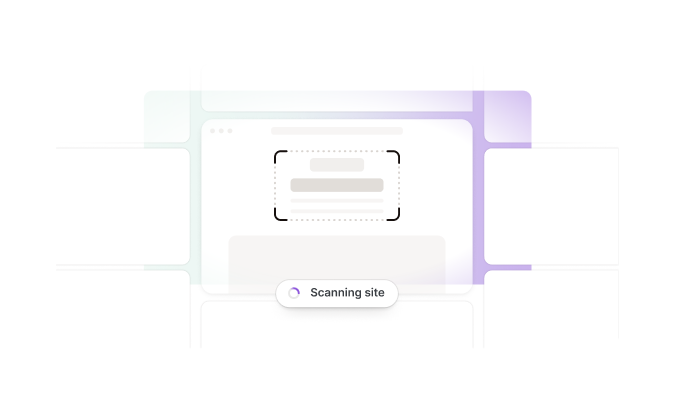
Start with a Smarter Accessibility Scan
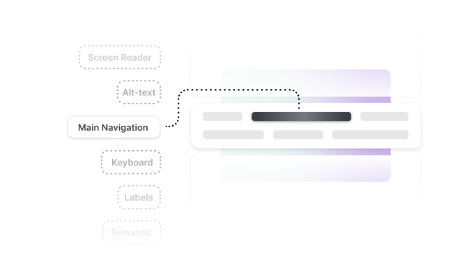
Scan your domain in seconds and get clear WCAG, ADA, and EAA findings that show what needs attention first.
- Report in seconds
- Prioritized by legal risk
- No credit card required