Choosing the Best Accessible Fonts for Your Website: A Step-by-Step Guide
Updated on January 12, 2026
Fonts play a bigger role in usability than most teams expect.
They affect how fast people read, how easily they scan content, and whether text feels comfortable or tiring. When fonts are hard to read, users don't always report it. They simply move on.
This guide focuses on font accessibility in real websites. We'll cover which fonts work best, what makes text readable in practice, and where font issues usually appear.
You'll also learn how to test font accessibility using free tools, including a font accessibility checker, and how to offer more readable fonts without changing your design or brand.
Understanding Accessible Fonts
The font you choose impacts more than just design; it affects readability for all users, including those with disabilities. Fonts that aren't designed with accessibility in mind can be difficult for people with dyslexia, low vision, or cognitive impairments to read.
Accessible fonts make text easier to read, helping users navigate your site comfortably and enhancing their overall experience. They also ensure your website meets ADA compliance, making it inclusive for all visitors.
Remember, accessibility isn't just about legal compliance—it's about ensuring everyone, regardless of ability, can engage with your content.
Free Web Accessibility Checker
Enter your website URL to get a free, instant accessibility scan with tabnav's checker.

How Fonts Impact Readability and Usability
Font choices affect more than visual style. They directly impact whether people can read, understand, and use your content.
For users with low vision, dyslexia, or cognitive challenges, small font issues add up quickly. Tight spacing, thin weights, or poor contrast can turn simple content into a barrier.
Font accessibility also affects everyone else. Clear text reduces eye strain, improves scanning, and makes pages feel easier to use. That often leads to better engagement and fewer drop-offs.
Getting fonts right early helps avoid accessibility issues later, improves overall usability, and supports better structure for search engines and assistive technologies.
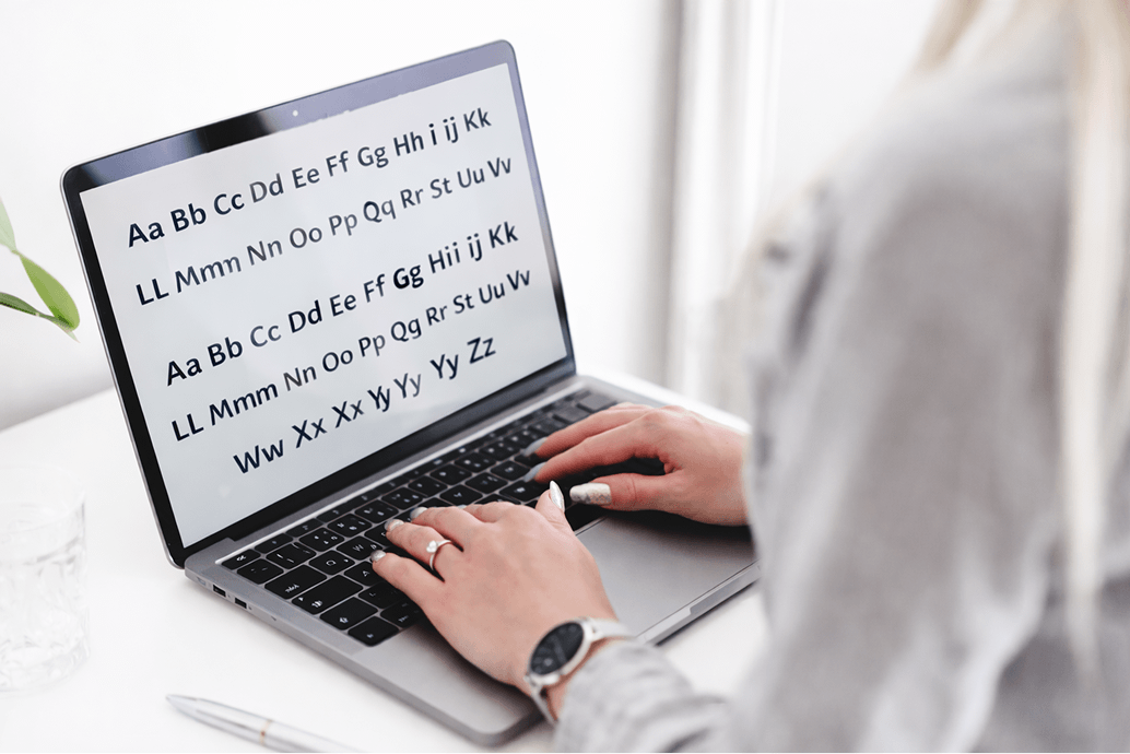
Accessible Font Examples You Can Use Today
When it comes to accessibility, some fonts are naturally more legible and user-friendly than others. Here are some of the most recommended fonts for body text and headings:
Headings
- Arvo (Free, open-source via Google Fonts)
- Rockwell (Paid license required)
- Museo (Paid license required)
- Slab serif fonts (Depends on the font, some are free, some require a license)
Body Text
- Arial (Paid license required, bundled with most operating systems)
- Verdana (Paid license required, bundled with most operating systems)
- Tahoma (Paid license required, bundled with most operating systems)
- Helvetica (Paid license required)
- Calibri (Paid license required, bundled with Microsoft products)
Why Accessible Fonts Matter
Legal Compliance
Font choices are part of accessibility requirements. If your text is hard to read or fails basic accessibility rules, it can put your website at risk.
Better Usability for More People
Accessible fonts make content easier to read for people with low vision, dyslexia, or cognitive challenges. Not everyone needs special fonts, but many users benefit from clear text that's easy to scan and understand.
Better Experience for Everyone
Clear fonts don't only help users with disabilities. They improve readability for all visitors, reduce eye strain, and make navigation feel smoother. This often leads to better engagement and fewer drop-offs.
SEO Benefits
Readable, well-structured text helps search engines understand your content more easily. When your site follows accessibility best practices, it's easier to crawl, index, and rank.
What Makes a Font Accessible?
To ensure your fonts are accessible, focus on the following characteristics:
- Letter Height & Differences Fonts should have clearly distinguishable uppercase and lowercase letters. Avoid fonts where characters like "o" and "e" look too similar, as this can confuse users with visual impairments.
- Adequate Letter Spacing Fonts that have adequate spacing between letters make it easier for users to read. Tight or cramped fonts can cause confusion, especially for those with dyslexia or low vision.
- Font Weights Choose fonts with medium or bold weights for body text, particularly at smaller sizes. Thin fonts are harder to read, especially on screens, and can be difficult for users with low vision.
- Font Colors & Contrast Proper contrast between text and background is essential for readability. Follow WCAG contrast guidelines, ensuring a minimum contrast ratio of 4.5:1 for body text and 3:1 for headings.
- Scalability Select fonts that can be resized without disrupting the layout of your website. This ensures that users with varying visual needs can adjust the text size without breaking the page's design.
Guidelines for Implementing Accessible Fonts
Choosing the right fonts is just the beginning. To fully implement accessible fonts, follow these guidelines:
- Font Size Start with a 16px (1 rem) font size for body text. Avoid using px for font sizes, as it doesn't scale well for accessibility. Opt for relative font sizes, such as rem or em, to allow users to resize the text as needed.
- Responsive Design Make sure your fonts are responsive and adapt to different devices and screen sizes. Whether on smartphones, tablets, or desktops, your font should be scalable and remain readable.
- Font Color & Contrast Ensure proper contrast between the text and background to meet WCAG standards. Tools like the Contrast Checker can help ensure that your font colors are compliant.
- Test with Screen Readers After applying accessible fonts, test how they perform with screen readers like NVDA, JAWS, and VoiceOver. Make sure your text is announced properly and clearly to users who rely on these technologies.
Font Accessibility Checker
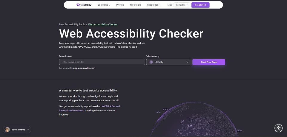
Using a font accessibility checker helps you find readability issues without guessing or redesigning your site.
Instead of reviewing fonts manually, these tools scan your pages and flag text that may cause accessibility problems, such as poor contrast, hard-to-read text, or font usage that affects readability.
Tools like the Tabnav accessibility checker include font-related accessibility checks and are free to use. You can scan your site, review text issues, and understand where readability may break accessibility requirements.
This makes it easier to validate font accessibility early, catch problems before launch, and recheck pages whenever content or design changes.
Making Fonts Accessible Without Changing Your Design
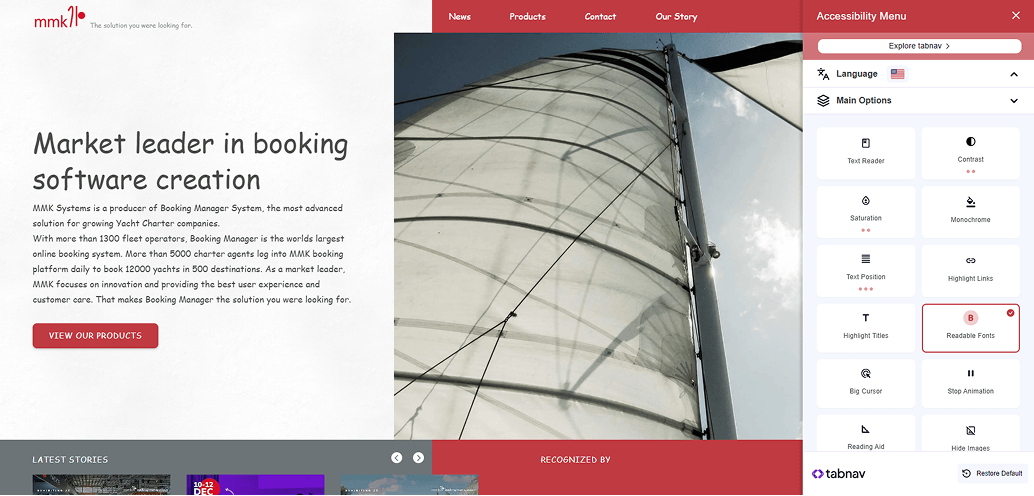
Making your fonts accessible doesn't mean you have to redesign your entire website or replace your brand typography.
In many cases, the original design can stay exactly as it is.
There are accessibility tools that let users adjust text on the client side, based on their own needs. This means the font changes only for the user who enables it, not for everyone else visiting your site.
One example is the tabnav accessibility widget, which includes a Readable Fonts option. When enabled, it replaces hard-to-read fonts with more accessible alternatives, improves spacing, and makes text easier to follow.
This option is also available in our free accessibility widget, so users can activate readable fonts instantly without any impact on your existing design or brand guidelines.
Summary
Font choices play a bigger role in accessibility than many teams expect. Clear, readable text helps users move through your content with less effort and fewer barriers.
You don't need a full redesign to improve things. Small adjustments, regular testing, and offering readable font options can go a long way.
When readability is treated as part of your ongoing process, your website becomes easier to use, easier to maintain, and more inclusive by default.

You might also like...