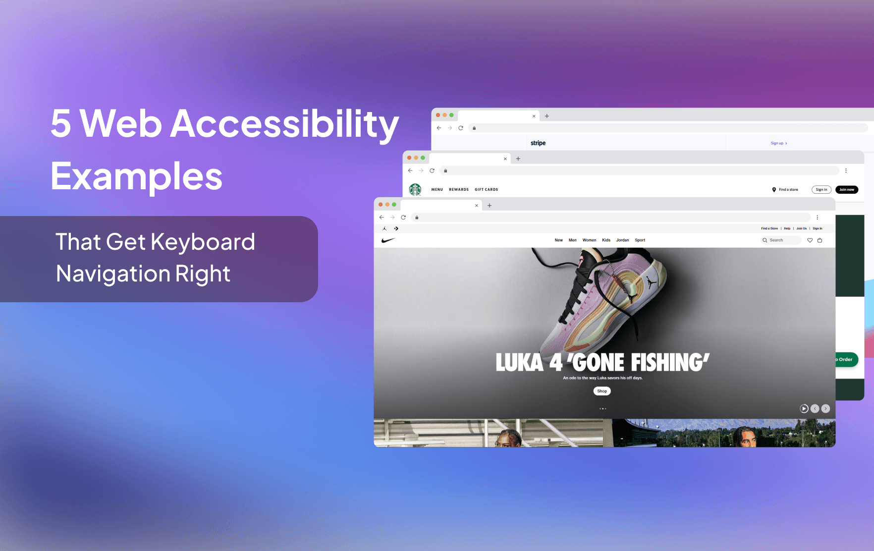
Accessible Website Design Examples with Strong Keyboard Navigation
Updated on December 24, 2025
Accessible Website Design in Practice
Keyboard navigation is not an extra feature. It is a core requirement of accessible website design and a critical part of how many users navigate the web.
The issue is that many websites technically “support” keyboards, but still fail in real use. Poor focus visibility, broken tab order, and inaccessible interactive elements make navigation frustrating or impossible.
When keyboard navigation is designed properly, websites become easier to use for everyone. Clear focus states, predictable navigation, and fully operable elements improve usability while aligning with WCAG and ADA requirements.
Below are real accessible website design examples that get keyboard navigation right. Each example highlights practical design and implementation choices you can apply to your own site.
Why Keyboard Navigation Is Essential to Accessible Website Design
Keyboard navigation is a core requirement of accessible website design. It ensures users can move through a website in a clear, predictable way without relying on a mouse.
For many users, keyboard navigation is simply faster and more efficient. Power users often prefer it because it allows quick movement through links, forms, and interface elements.
For others, it is the only way to navigate. This includes people who use screen readers, switch devices, or voice input tools that rely on keyboard interaction behind the scenes.
When keyboard navigation is implemented correctly, every interactive element remains usable. Focus order makes sense, focus indicators are visible, and no functionality is blocked. That's why the examples in this guide highlight websites that work fully without a mouse.
Web accessibility examples that meet the highest standards ensure:
-
Logical and predictable tab order
The order in which elements receive focus should follow the natural reading and layout flow of the page - typically top to bottom, left to right. This ensures users can navigate smoothly without confusion or getting lost.
-
Clear and consistent focus states
Users should always be able to see where their keyboard focus is on the page. This often means using outlines, highlights, or other visual cues that remain visible against all backgrounds. Without clear focus indicators, users can easily become disoriented.
-
Activatable elements using keyboard keys
Every interactive element-such as links, buttons, and form inputs-should be fully operable with the keyboard. Users should be able to use keys like Enter or Space to trigger actions, just as they would with a mouse. Navigation should also support Tab to move forward and Shift + Tab to move backward, enabling users to reach all parts of the interface in a logical and consistent flow.
-
Navigation landmarks like skip links and ARIA roles
These provide structure for assistive technologies and keyboard users. Skip links allow users to jump directly to main content, while ARIA roles define the purpose of elements (like navigation, banners, or main regions), helping screen readers and keyboard navigation tools interpret the page layout more accurately.
These elements are foundational to meeting WCAG guidelines, particularly:
- 2.1.1 Keyboard (Level A)
- 2.4.3 Focus Order (Level A)
- 2.4.7 Focus Visible (Level AA)
- 2.4.1 Bypass Blocks (Level A)
- 2.4.7 Name, Role, Value (Level A)
Understanding how these guidelines shape keyboard usability is essential when evaluating accessible website examples.
How We Selected These Accessible Website Examples
We chose these web accessibility examples by auditing how well they support keyboard-based interaction. All five accessible website examples provide:
- Full functionality via keyboard
- Strong focus visibility and tab flow
- Accessibility features that meet the expectations of an ADA-compliant website
These web accessibility examples offer practical lessons for developers and designers looking to create their own ADA compliant website or improve their accessible website design. Each site reflects thoughtful implementation of web accessibility principles.
The 5 Web Accessibility Examples
-
We begin with one of our favorite web accessibility examples - Semrush's dashboard. What makes it especially impressive isn't just the sleek design or data-rich interface, but how well it supports keyboard navigation across complex UI components.
At first, our team was skeptical. We've used the dashboard before, and while we were familiar with its structure, we wanted to put its keyboard accessibility to the test for this blog. To our surprise, it exceeded expectations.

From the main navigation to deep interactive tables and popups, the keyboard flow is smooth and logical. Every tab stop follows a clear sequence, and interactive components like filters, dropdowns, and buttons respond perfectly to keyboard actions.
One moment that really stood out was when we tabbed through a complex popup on the dashboard - focus indicators moved smoothly in the correct sequence as the layout shifted, and everything stayed accessible. It's one of those web accessibility examples that truly gets the interaction right, even under pressure.
This dashboard proves that even with dense data and advanced controls, it's possible to maintain clear, reliable keyboard navigation throughout the entire interface.
-
We had a little fun with this one. While GitHub is known for its developer tools, what really caught our attention was how smooth and well-structured their mega menu is when navigating with a keyboard.
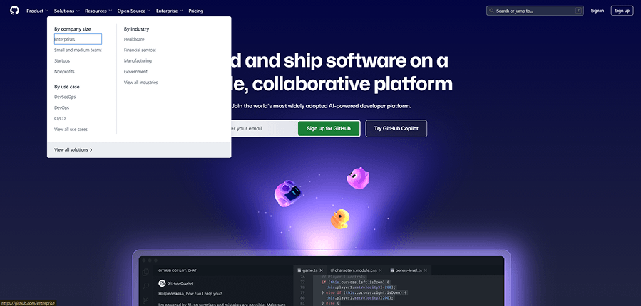
We focused on how the tab order behaves within the mega menu, and it didn't disappoint.
One subtle but very clever detail stood out - GitHub chose a focus indicator color that works beautifully across both the dark background of the top nav links and the light background of the expanded menu. This thoughtful design keeps the indicator clearly visible and preserves accessibility contrast throughout.
That kind of attention to detail is rare.
GitHub gave us a textbook example of accessible navigation - not just by making it functional, but by making it feel seamless.
-
Figma is one of the most design-forward platforms on the web, but what really surprised us was how well their contact form handled accessibility.
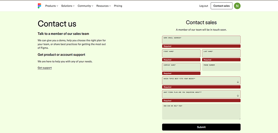
We tested their "Contact Sales" form and were impressed by how it responded to keyboard input. After attempting to submit the form without completing the required fields, the focus indicator jumped directly to the first field needing input-just as it should. This meetsWCAG success criterion 3.3.1 - Error Identification, which requires that users are informed of errors and guided to them.
The styling was clear, the field feedback was easy to follow, and it made what's normally a frustrating moment feel manageable. It's a great example of how accessible website design doesn't just meet standards-it helps users stay in control.
We dive deeper into these kinds of form interactions in our blog " A Comprehensive Guide to Accessible Forms."
-
This example caught our attention because of the complexity of the layout. While many e-commerce sites offer standard product pages using premade templates with color or size selectors, Starbucks took a different route.

Their product pages are fully customized and built around the brand's identity - something you can't easily replicate with out-of-the-box components. It looks and feels like it was built specifically for them, and it makes sense considering how important brand experience is for Starbucks.
What really impressed us was how, despite the visual arrangement of elements being optimized for design, the keyboard navigation remained logical and accessible. Even when components were scattered visually, the tabbing flow made sense. Focus indicators appeared consistently, and users were guided through the form fields in the correct sequence.
It's a smart implementation of WCAG success criterion 2.4.3 - Focus Order, and it shows how custom design doesn't have to come at the cost of accessibility.
-
We had to end on a high note - and Nike delivered. Known for its bold design and slick user experience, Nike's homepage caught our attention for a reason that's often overlooked: the carousel in the hero section.

Carousels are infamous for being accessibility nightmares. Many auto-play without a way to pause, violating WCAG success criterion 2.2.2 - Pause, Stop, Hide. Others are only operable with a mouse, leaving keyboard users completely out of the loop.
Nike got this right. Their hero carousel includes visible control buttons that allow users to manually scroll through the slides. Even better, there's a mechanism to stop the animation, which runs longer than five seconds. This ensures that keyboard users can fully explore the content at their own pace-without relying on a mouse or missing key content.
It's a great reminder that flashy UI elements can still be accessible when designed thoughtfully. And in this case, Nike turned a common accessibility pitfall into one of the more impressive web accessibility examples we've seen.
Key Takeaways from These Examples
These web accessibility examples show that building for keyboard users doesn't compromise aesthetics or performance.
Instead, it creates better experiences for everyone by making websites more intuitive and user-friendly.
These accessible website examples illustrate how usability and compliance go hand in hand.
By looking at examples of accessible websites, we can better understand how to apply these principles to our own projects and improve accessibility from the ground up.
From tabbing order to ARIA roles, every one of these accessible website examples reinforces the importance of thoughtful navigation. These are web accessibility examples that show what good design looks like in practice.
Free Web Accessibility Checker
Enter your website URL to get a free, instant accessibility scan with tabnav's checker.

Why tabnav Monitor Is the Right Tool for Keyboard Accessibility Testing
Tabnav Monitor is built specifically to test and monitor keyboard accessibility as part of accessible website design. It goes beyond static scans by focusing on how users actually navigate a site using a keyboard.
The platform continuously checks for keyboard-related issues such as broken tab order, missing or hidden focus indicators, inaccessible interactive elements, and blocked navigation paths. These are the exact problems that prevent users from accessing content without a mouse.
Unlike traditional accessibility scanners, tabnav Monitor highlights real usability issues tied to keyboard navigation. It shows where users get stuck, which elements cannot be reached, and what needs to be fixed to meet WCAG keyboard requirements.
Final Thoughts
Keyboard navigation is one of the most critical areas in accessible website design. These web accessibility examples prove that inclusive design is possible and powerful. Each ADA-compliant website in this list reflects the core values of WCAG guidelines and offers actionable insights.
By exploring examples of accessible websites that prioritize keyboard support, we can learn how to create experiences that work for everyone. If you're looking to improve your site, studying web accessibility examples is one of the best ways to start.

You might also like...