60 Best Website Design Examples for 2026
Updated on January 4, 2026
Free Accessibility Checker
Scan your site for free and identify accessibility issues with tabnav's WCAG checker.
Instant WCAG compliance report
If you're looking for the best website design examples, here are the layouts, visuals, and UX ideas shaping next-generation websites.
Whether you're a designer improving your craft, a startup founder searching for fresh ideas, or a product manager looking for practical UI/UX direction, studying real websites is one of the fastest ways to get inspired and level up your work.
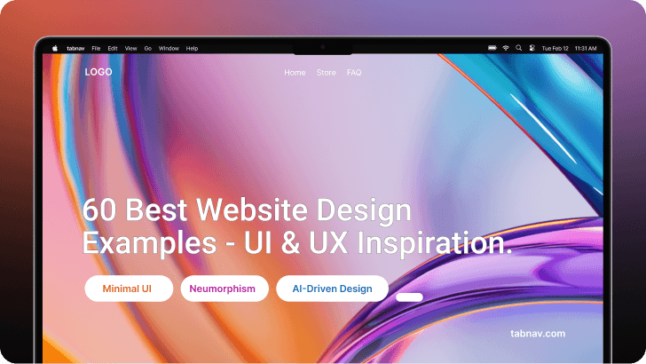
Many teams still rely on outdated layouts, making their sites feel slow and behind user expectations. With the best website design inspiration, you can spot what works, understand why it works, and create experiences that feel current, intuitive, and aligned with today's trends.
The web design examples below include both desktop and mobile views so you can see how each layout works on real screens.
At the end of this guide, you'll get access to the inspiration tools and modern website design workflows experts rely on - the kind of tricks pros usually keep to themselves.
Let's dive into the examples.
-
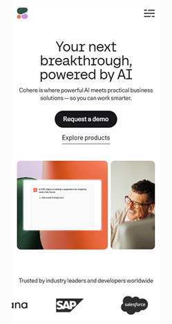
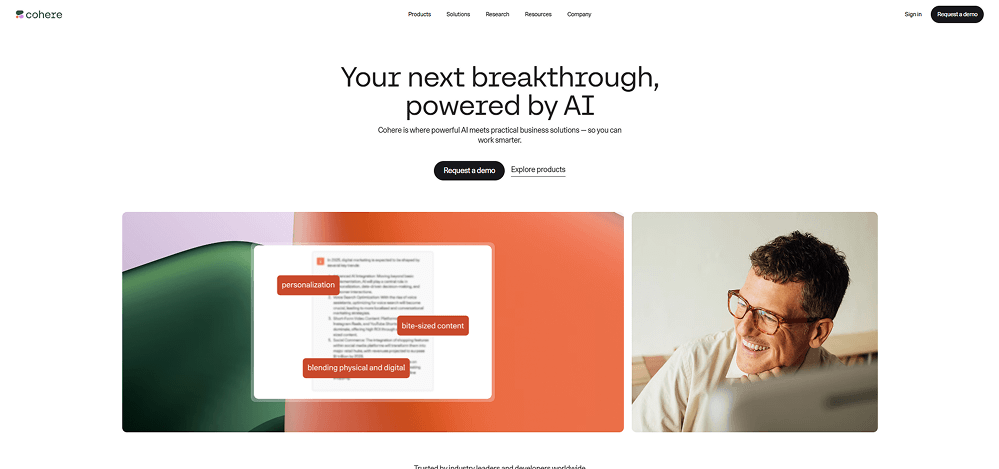
Cohere - Clean AI Branding With Product-First Storytelling
 Visit website
What You Can Learn From This Design
Cohere proves that AI products can be technically advanced and look easy to use. The design keeps clarity. Adds personality. Cohere makes the point clear.
Key Design Highlights
-
Hero Impact - Bold headline with gradient background creates immediate visual interest
-
Whitespace Mastery - Generous spacing prevents cognitive overload and improves scannability
-
Visual Hierarchy - Clear typography scale guides users through content effortlessly
Design & Technology Breakdown
-
Font Family
CohereText, Space Grotesk, Inter, ui-sans-serif, system-ui, sans-serif, Apple Color Emoji, Segoe UI Emoji, Segoe UI Symbol, Noto Color Emoji. -
Color Palette
-
Animations
GSAP -
CMS
Sanity
-
-
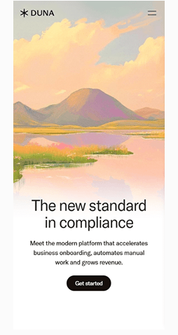
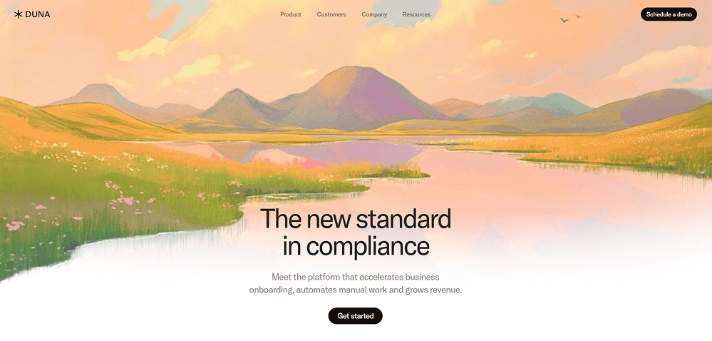
Duna - Warm Aesthetic With Story-First Design
 Visit website
What You Can Learn From This Design
When we look at the Duna website example we see how a hand-painted visual style can turn a product into an welcoming experience. The hero section puts emotion first. Lets the message land gently. The message does not feel corporate or rigid.
Key Design Highlights
-
Art-Driven Hero - Soft hand-painted landscape creates instant emotional warmth.
-
Minimal UI Structure - Light typography and wide spacing keep the focus on the message.
-
Pastel Color Story - Warm gradients guide the eye without overwhelming the user.
Design & Technology Breakdown
-
Font Family
Inter, sans-serif. -
Color Palette
-
Animations
None -
CMS
WordPress
-
-
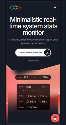
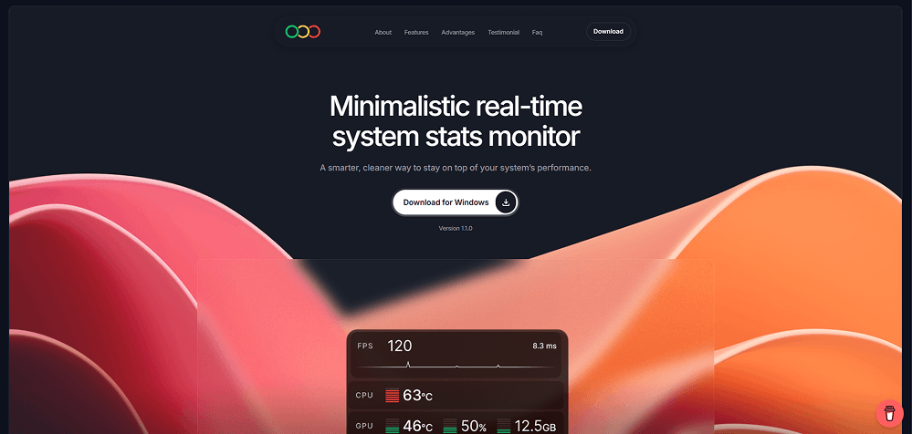
Cleanmeter - Minimalistic Real-Time System Monitor
 Visit website
What You Can Learn From This Design
Cleanmeter shows how a minimal UI can deliver a polished experience without distractions. The layout focuses on clarity, fast readability, and sharp visual contrast, proving that functional tools can still feel premium and modern.
Key Design Highlights
-
Dark Minimalism - Deep background tones help the stats card stand out and keep the interface sharp.
-
Clean Visual Weight - Simple typography and spacing create a balanced hierarchy that's easy to scan.
-
Soft Contrast Accents - Warm gradients add depth and energy without overpowering the core content.
Design & Technology Breakdown
-
Font Family
Inter, sans-serif -
Color Palette
-
Animations
None -
CMS
Webflow
-
-
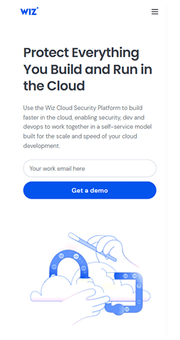
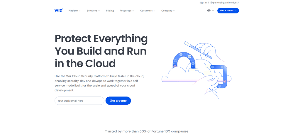
Wiz - Clean Cloud Security Landing With Friendly Illustrations
 Visit website
What You Can Learn From This Design
Wiz shows how a modern website design can feel both technical and approachable. The strong left-aligned headline, open white space, and playful line illustration work together to explain a complex cloud security product in a simple, human way.
Key Design Highlights
-
Headline First Layout - Large left-aligned copy makes the core promise clear before anything else.
-
Friendly Line Illustration - Light, minimal drawing keeps the page playful while reinforcing the cloud story.
-
Trust-Oriented Framing - Subhead, CTA, and Fortune 100 logos below build confidence without overwhelming the hero.
Design & Technology Breakdown
-
Font Family
sans-serif, system-ui, sans-serif -
Color Palette
-
Animations
Lottie -
CMS
DatoCMS
-
-
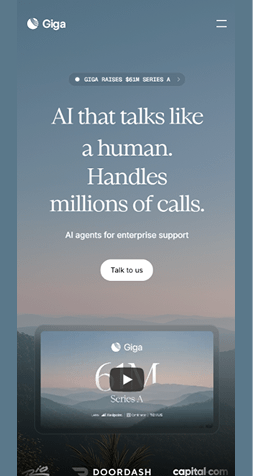
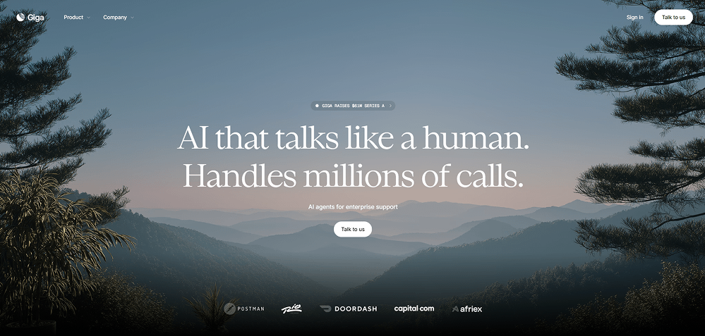
Giga - Scenic AI Hero Design With Future-Focused Atmosphere
 Visit website
What You Can Learn From This Design
Giga shows how cinematic, nature-driven landscapes can create a calm, futuristic atmosphere that aligns beautifully with modern AI branding. It demonstrates how pairing soft gradients, horizon depth, and clean typography can make complex AI technology feel warm, human, and trustworthy.
Key Design Highlights
-
Cinematic Landscape Hero - Wide atmospheric scenery sets an emotional tone and feels aligned with the new visual trends in AI.Soft Futuristic Aesthetic - Misty gradients and layered mountains create a sense of depth without overwhelming the interface.Elegant Typography - Refined serif and clean sans-serif pairings deliver a premium, human-centered experience.
Design & Technology Breakdown
-
Font Family
sans-serif -
Color Palette
-
Animations
Three.js -
CMS
WordPress
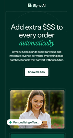
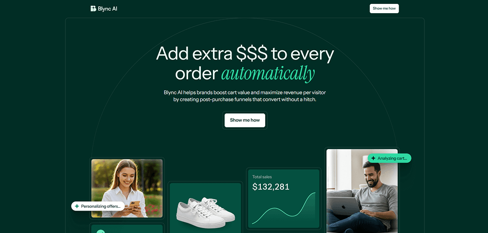
Blync AI - Deep, Conversion-Focused Design With Modern E-Commerce Identity
 Visit website
What You Can Learn From This Design
Blync AI shows how a dark-themed commerce layout can feel premium, modern, and conversion-driven at the same time. The design uses focused contrast, soft animations, and clear modular components to highlight product value without overwhelming the user.
Key Design Highlights
-
High-Contrast Identity - Deep green tones paired with bright accents create a polished, data-driven look that stands out immediately.Commerce-Centric Layout - Product cards, metrics, and UI elements visually support the funnel-focused messaging.Refined Visual Balance - Clean typography and structured spacing guide the eye naturally across the interface.
Design & Technology Breakdown
-
Font Family
sans-serif -
Color Palette
-
Animations
GSAP -
CMS
Webflow
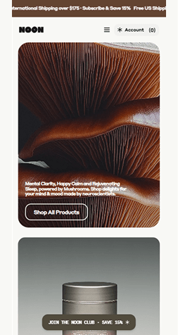
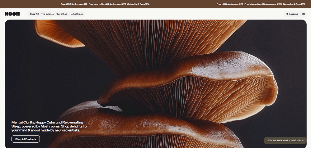
Noon - Nature-Driven Aesthetic With Premium Organic Branding
 Visit website
What You Can Learn From This Design
Noon shows how product-first storytelling works when the visuals feel raw, natural, and high-end. The use of macro photography, earthy tones, and spacious layouts creates an immersive brand experience that feels premium and science-backed.
Key Design Highlights
-
Organic Visual Storytelling - Large macro mushroom photography builds an immediate sense of natural luxury.Earth-Inspired Palette - Warm browns and deep neutrals reinforce the brand's scientific-meets-nature positioning.Minimal Commercial UI - Clean buttons and quiet typography keep the focus entirely on the product experience.
Design & Technology Breakdown
-
Font Family
Styrene -
Color Palette
-
Animations
None -
CMS
Shopify
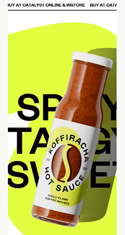
Koffiracha - Loud Type And Packaging-First Hot Sauce Landing
 Visit website
What You Can Learn From This Design
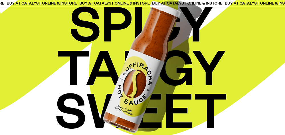
Koffiracha is a good website design example of how to go all in on energy and attitude. The bottle is always the hero, but the oversized typography and diagonal color shapes keep the page in motion even without heavy interaction. It proves you can be playful and experimental while still keeping the product front and center.
Key Design Highlights
-
Maximalist Typography - Huge, overlapping type turns the brand message into a graphic element that frames the product.Packaging Front And Center - The rotating bottle stays in focus, showing the label clearly and reinforcing shelf recognition.High-Energy Color Contrast - Neon yellow, crisp black, and white work together to create a bold, memorable look that feels spicy and modern.
Design & Technology Breakdown
-
Font Family
Foundersgrotesk, sans-serif -
Color Palette
-
Animations
GSAP -
CMS
WordPress
Travelwise - Friendly Travel Planning With a Family-First Touch
 Visit website
What You Can Learn From This Design
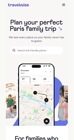
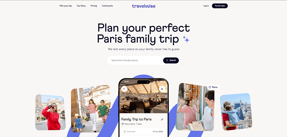
Travelwise shows how soft colors, rounded UI, and warm photography can make a digital product feel trustworthy and family-friendly. The design keeps everything light, approachable, and easy to scan - perfect for a service built around stress-free planning.
Key Design Highlights
-
Warm Lifestyle Visuals - Real family photos create instant emotional connection and reinforce the product purpose.Soft, Friendly Interface - Rounded shapes and pastel tones make the experience calm and unintimidating for all users.Clear Action Path - A focused search bar and simple CTA keep the user flow straightforward from the first moment.
Design & Technology Breakdown
-
Font Family
Athletics, system-ui, -apple-system, Segoe UI, Roboto -
Color Palette
-
Animations
None -
CMS
WordPress
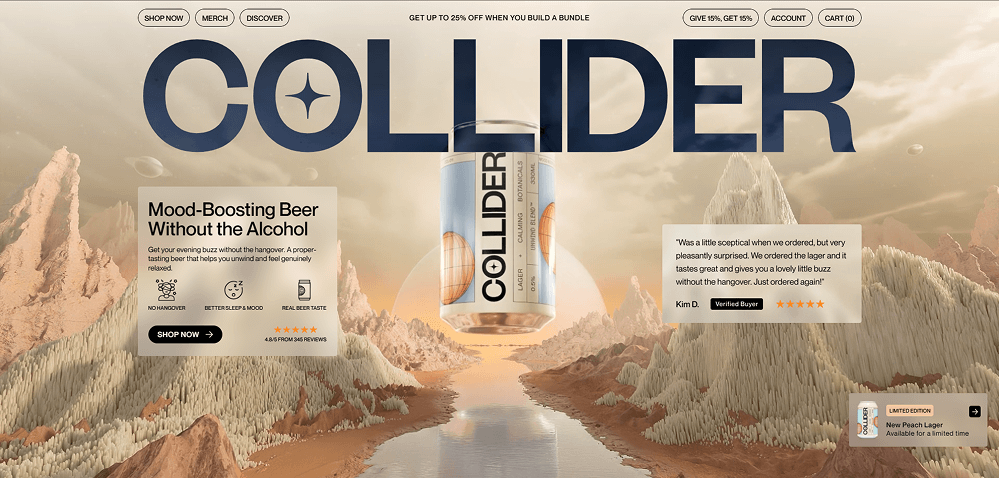
Collider - Futuristic Aesthetic With Sci-Fi Product Energy
 Visit website
What You Can Learn From This Design
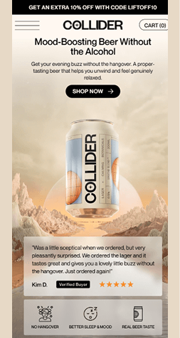
Collider shows how bold sci-fi worlds can transform a simple product into an immersive brand experience. The surreal landscape, oversized typography, and floating can blend storytelling with strong ecommerce clarity - proving that emotional world-building can sell even everyday items like beverages.
Key Design Highlights
-
Sci-Fi Worldbuilding - A surreal desert landscape turns the product into a cinematic hero and creates instant memorability.Ultra-Bold Typography - Massive headline lettering delivers high-impact branding without distracting from the product.Floating Product Focus - The suspended can design draws the eye immediately and reinforces a premium, futuristic feel.
Design & Technology Breakdown
-
Font Family
Athletics, system-ui, -apple-system, Segoe UI, Roboto -
Color Palette
-
Animations
GSAP -
CMS
Shopify
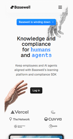
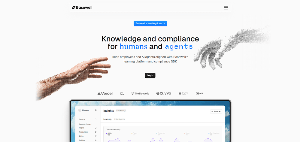
Basewell - Human-Centered Compliance With a Digital Edge
 Visit website
What You Can Learn From This Design
Basewell shows how blending organic, human imagery with digital pixel effects can communicate trust and the connection between people and AI. The clean layout keeps the experience focused - and you can see the subtle differences between the desktop and mobile designs while the overall feel stays consistent.
Key Design Highlights
-
Human-AI Visual Blend - The dotted-pixel hands create a symbolic bridge between people and technology in a memorable way.Ultra-Clean Layout - Generous whitespace and soft typography make complex topics feel simple and approachable.Calm Neutral Palette - Minimal color use helps the illustrations stand out while keeping the interface professional and distraction-free.
Design & Technology Breakdown
-
Font Family
GeistSans, GeistSans Fallback -
Color Palette
-
Animations
None -
CMS
Shopify
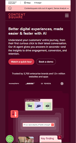
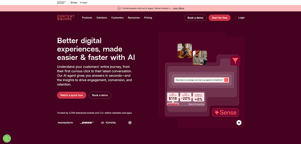
Contentsquare - AI-Driven UX Insights With a Bold, Conversion-Focused Design
 Visit website
What You Can Learn From This Design
Contentsquare uses bold color, strong typography, and product-centered visuals to create a confident, performance-driven look. The interface clearly communicates speed, clarity, and the value of AI-powered insights.
Key Design Highlights
-
Bold Color Identity - Deep reds and gradients create a strong emotional impact and make the product visuals stand out.Conversion-Ready Hero - Clear CTAs like “Book a demo” and “Start for free” keep the user focused on action from the first second.Product-First Visuals - Screens, cards, and UI elements highlight the platform's capabilities without overwhelming the layout.
Design & Technology Breakdown
-
Font Family
sans-serif, Apple Color Emoji, Segoe UI Emoji, Segoe UI Symbol. -
Color Palette
-
Animations
Next.js -
CMS
WordPress
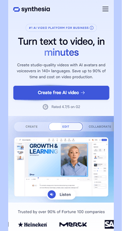
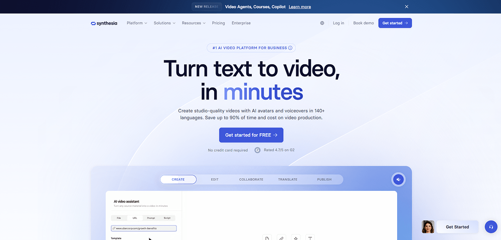
Synthesia - Ultra-Clean AI Video Creation With a Soft, Modern Flow
 Visit website
What You Can Learn From This Design
Synthesia uses soft gradients, oversized typography, and calm spacing to create a smooth, trustworthy introduction to their AI video platform - keeping the experience fast, modern, and easy to understand.
Key Design Highlights
-
Smooth Gradient Identity - Light blues and soft transitions give the interface a calm, futuristic feel.Clear Value Message - The bold headline instantly communicates speed and simplicity without clutter.Focused Conversion Path - A single strong CTA and minimal distractions guide users directly into action.
Design & Technology Breakdown
-
Font Family
Basiersquare Webfont, sans-serif. -
Color Palette
-
Animations
None -
CMS
Webflow
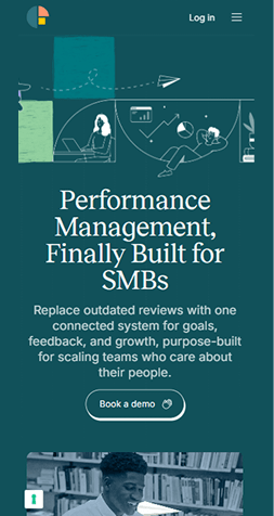
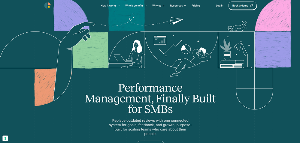
Frankli - Warm, Human Performance Management for Modern Teams
 Visit website
What You Can Learn From This Design
Frankli uses soft illustrations, friendly colors, and hand-drawn shapes to make performance management feel personal instead of corporate. The design builds trust and keeps the experience approachable.
Key Design Highlights
-
Illustrated Storytelling - Hand-drawn scenes show real work moments and make the product feel human-first.Soft Visual Language - Pastel blocks, curved lines, and sketch textures reduce tension around a normally stressful topic.Clear Focus on People - Characters, gestures, and simple UI elements highlight the human side of performance workflows.
Design & Technology Breakdown
-
Font Family
Basiersquare Webfont, sans-serif. -
Color Palette
-
Animations
None -
CMS
WordPress
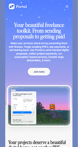
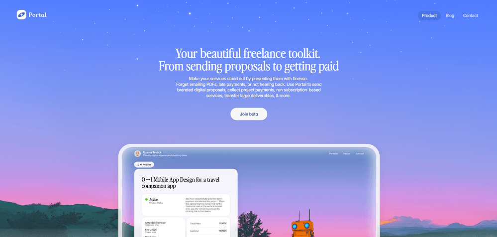
Portal - A Soft, Minimal Toolkit for Modern Freelancers
 Visit website
What You Can Learn From This Design
Portal uses a dreamy gradient, calm typography, and spaced-out visuals to create a serene experience that feels premium without being heavy.
Key Design Highlights
-
Dreamy Gradient Atmosphere - Soft sky-to-sunset colors make the hero instantly memorable and emotionally warm.Minimal Typography - Clean type with generous spacing keeps the message clear and easy to skim.Product-First Preview - The large interface mockup grounds the visual style and shows real functionality right away.
Design & Technology Breakdown
-
Font Family
Sans-serif. -
Color Palette
-
Animations
Framer Motion -
CMS
None
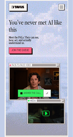
Tavus - Human-Like AI Interaction With Personality
 Visit website
What You Can Learn From This Design
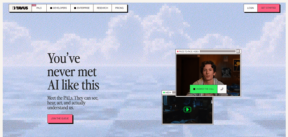
Tavus uses retro-styled visual noise, layered windows, and live-call UI elements to show personality and motion immediately, making the page feel alive and human-centric.
Key Design Highlights
-
Layered Window UI - Stacked video frames create an operating-system feel that reinforces the product concept.Retro Pixel Texture - The grainy background adds personality and makes the visuals stand out from modern flat designs.Human First Messaging - The huge headline and conversational copy create an emotional hook right away.
Design & Technology Breakdown
-
Font Family
Perfectlynineties, Georgia, sans-serif. -
Color Palette
-
Animations
None -
CMS
WordPress
Blended Tech - A Modern, Intuitive Approach to Winery Management

 Visit website
What You Can Learn From This Design
Blended Tech shows how a calm, structured layout paired with gentle color accents can make complex software feel simple and approachable. The clean typography and centered hero layout help communicate clarity and professionalism from the first glance.
Key Design Highlights
-
Soft Gradient Atmosphere - The pastel sky-to-ground gradient creates warmth and sets a calm, premium tone.Clear Visual Hierarchy - Large, bold headings paired with muted sub-text make the message easy to digest instantly.Friendly UI Elements - Rounded buttons, smooth icons, and spacious imagery make the experience feel modern and human-focused.
Design & Technology Breakdown
-
Font Family
Roboto, sans-serif. -
Color Palette
-
Animations
None -
CMS
Webflow
Crisp - AI-Powered Customer Support Made Simple
 Visit website
What You Can Learn From This Design
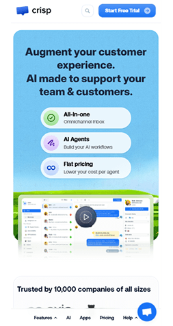
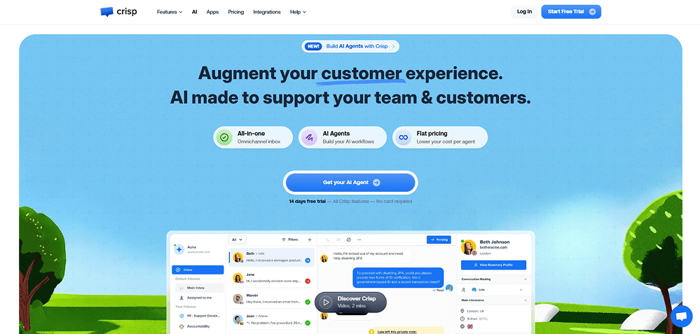
Crisp shows how strong visuals and a friendly tone can make complex AI support tools feel simple, fun, and accessible. The layout keeps everything clean and focused while still feeling lively.
Key Design Highlights
-
Playful Visual Identity - Soft illustrations and rounded UI elements make the product feel friendly and approachable.Clear Value Blocks - Three quick feature badges summarize the product benefits without overwhelming the user.Strong Conversion Focus - A bold CTA button and free-trial note keep attention on taking action immediately.
Design & Technology Breakdown
-
Font Family
Crisp Inter Bold, sans-serif. -
Color Palette
-
Animations
GSAP -
CMS
None
Amzigo - Modern Gradient Design With Product-Focused Visuals
 Visit website
What You Can Learn From This Design
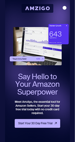
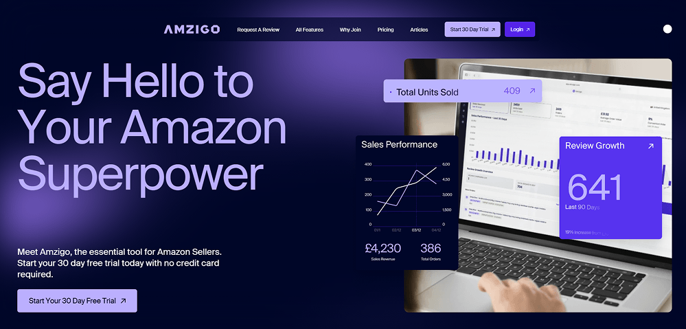
Amzigo's homepage uses oversized typography, glowing purple gradients, and floating analytics cards to create a dynamic, high-energy look. The composition balances a dramatic hero headline on the left with visually rich dashboard previews on the right, giving the layout a polished, product-driven feel.
Key Design Highlights
-
Oversized Hero Typography - The massive headline anchors the entire layout and instantly sets a strong visual hierarchy.Floating Analytics Cards - Metric cards placed over the product shot add depth and keep the design lively without feeling cluttered.Gradient-Rich Atmosphere - Soft purple glows and dark transitions create a sleek, modern background that makes the UI elements stand out clearly.
Design & Technology Breakdown
-
Font Family
Suisse Intl, sans-serif. -
Color Palette
-
Animations
GSAP -
CMS
WordPress
Superhuman - Soft Gradient Design With Calm, Ambient Productivity Visuals
 Visit website
What You Can Learn From This Design
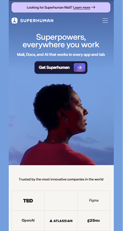
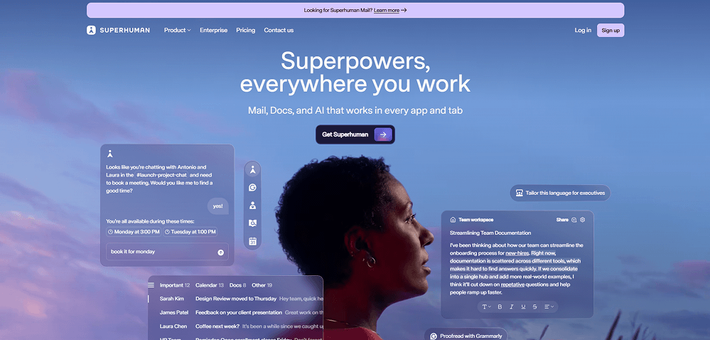
Superhuman's homepage blends sky-toned gradients, airy spacing, and floating UI cards to create a calm, focused environment. The soft background photography and translucent panels give the layout a lightweight, modern feel while keeping the interface visually engaging.
Key Design Highlights
-
Sky-Gradient Atmosphere - The soft blue and lavender gradient creates a peaceful mood and frames the hero content beautifully.Floating Glass Panels - Translucent chat bubbles, cards, and workspace windows add depth without overcrowding the layout.Human-Centered Hero - The profile photo grounding the right side balances the soft UI elements and brings a relatable, personal touch to the design.
Design & Technology Breakdown
-
Font Family
Super Sans. -
Color Palette
-
Animations
None -
CMS
WordPress
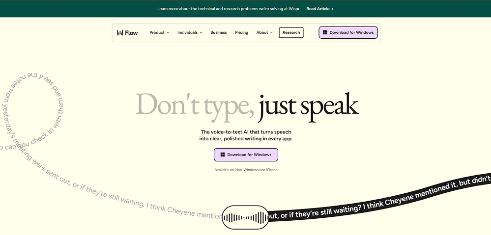
Wispr Flow - Minimal, Editorial-Like Design With a Calm Voice-First Aesthetic
 Visit website
What You Can Learn From This Design
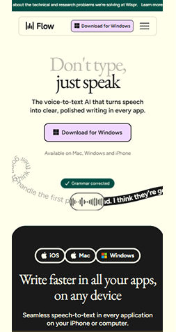
Wispr Flow website example uses a light, print-inspired layout with oversized serif typography to create a refined, editorial feel. The generous negative space and quiet cream background direct full attention to the hero message, while the curved text path adds movement without disrupting the calm tone.
Key Design Highlights
-
Editorial Typography - The large serif headline feels elegant and expressive, giving the hero a magazine-style presence.Soft Neutral Canvas - The pale cream background keeps the page airy and uncluttered, letting the message and visuals stand out clearly.Curved Voice Path Element - The flowing text path at the bottom introduces motion and personality while reinforcing the voice-driven concept.
Design & Technology Breakdown
-
Font Family
Arial, sans-serif. -
Color Palette
-
Animations
GSAP -
CMS
Webflow
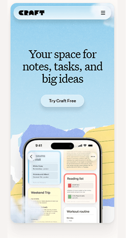
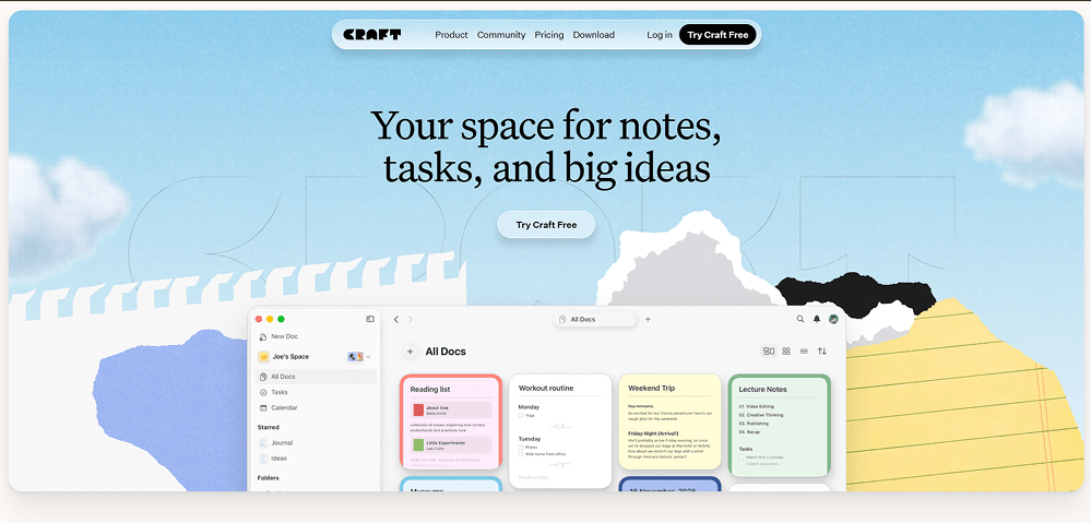
Craft - Playful Paper-Inspired Design With Soft, Creative Visuals
 Visit website
What You Can Learn From This Design
Craft's hero section uses textured paper layers, hand-torn shapes, and soft sky gradients to create a warm, creative atmosphere. The combination of editorial typography and collage-style elements gives the page an inviting, imaginative feel that mirrors the product's focus on ideas and organization.
Key Design Highlights
-
Paper Texture Aesthetic - Rough edges, torn shapes, and subtle grain make the design feel tactile and handcrafted.Soft Sky Gradient - Light blues and diffused clouds add calmness and contrast beautifully with the playful paper layers.Inviting Editorial Typography - The large serif headline adds personality and pairs well with the creative collage background.
Design & Technology Breakdown
-
Font Family
Arial, sans-serif. -
Color Palette
-
Animations
Framer Motion -
CMS
Not specified
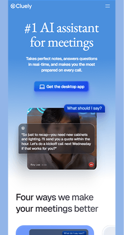
Cluely - Bright Gradient Design With a Clean, Lightweight Hero Layout
 Visit website
What You Can Learn From This Design
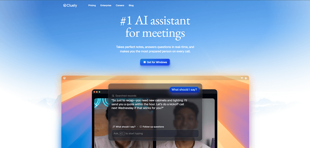
Cluely's hero section uses airy blue-to-white gradients, soft shadows, and a neatly layered product mockup to create a fresh, uplifting feel. The spacious layout and centered typography keep the interface calm, while subtle color transitions add depth without distraction.
Key Design Highlights
-
Airy Blue Gradient - The smooth sky-like gradient sets a light, optimistic tone and gives the hero a polished, professional look.Soft Layered Mockups - Overlapping windows with rounded corners create dimension and highlight the product naturally.Calm Centered Typography - The clean serif headline adds clarity and balances well with the bright, expansive background.
Design & Technology Breakdown
-
Font Family
ui-sans-serif, system-ui, sans-serif, Apple Color Emoji, Segoe UI Emoji. -
Color Palette
-
Animations
Not specified -
CMS
WordPress
Gamma - Bright, Structured Layout With Playful 3D Visuals
 Visit website
What You Can Learn From This Design
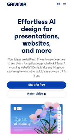
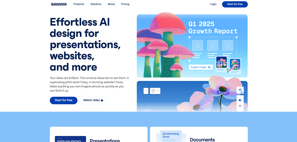
Gamma pairs bold, oversized typography with clean white space and vivid 3D illustrations to create a sharp, modern hero. The split layout keeps the message clear on the left while lively, colorful graphics bring personality and energy to the right side.
Key Design Highlights
-
Bold Typographic Layout - The large, dense headline establishes strong hierarchy and anchors the entire hero section.Vibrant 3D Illustrations - Bright, textured graphics add personality and break the minimal structure in a playful way.Crisp White Space - Generous spacing and clean alignment keep the page feeling fresh and easy to read.
Design & Technology Breakdown
-
Font Family
'PPMori',sans-serif. -
Color Palette
-
Animations
Emotion -
CMS
WordPress
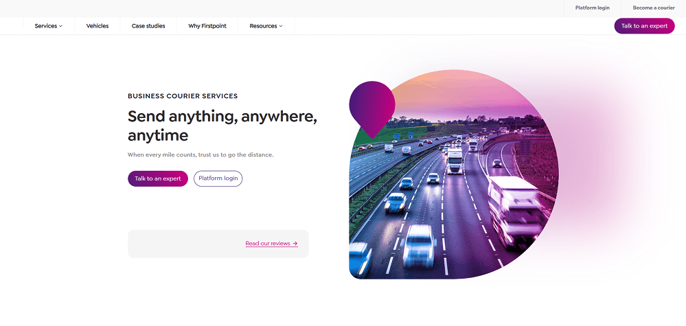
Firstpoint Logistics - Clean Corporate Layout With a Bold, Gradient-Tinted Visual
 Visit website
What You Can Learn From This Design
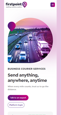
Firstpoint Logistics uses a minimal, left-aligned layout paired with a striking circular photo treatment to create a modern, trustworthy hero. The soft white space and simple typography keep the message clear, while the vivid magenta-to-purple gradient overlay adds a memorable visual hook.
Key Design Highlights
-
Circular Hero Image - The cropped circle photo creates a strong focal point and breaks the traditional rectangular layout.Gradient Overlay Effect - The magenta-purple tint adds energy and brand personality to an otherwise neutral corporate scene.Clean Left-Aligned Structure - Simple typography and generous spacing make the content easy to scan and maintain a professional feel.
Design & Technology Breakdown
-
Font Family
'PPMori',sans-serif. -
Color Palette
-
Animations
Not specified -
CMS
HubSpot
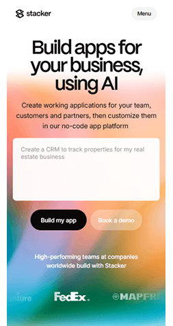
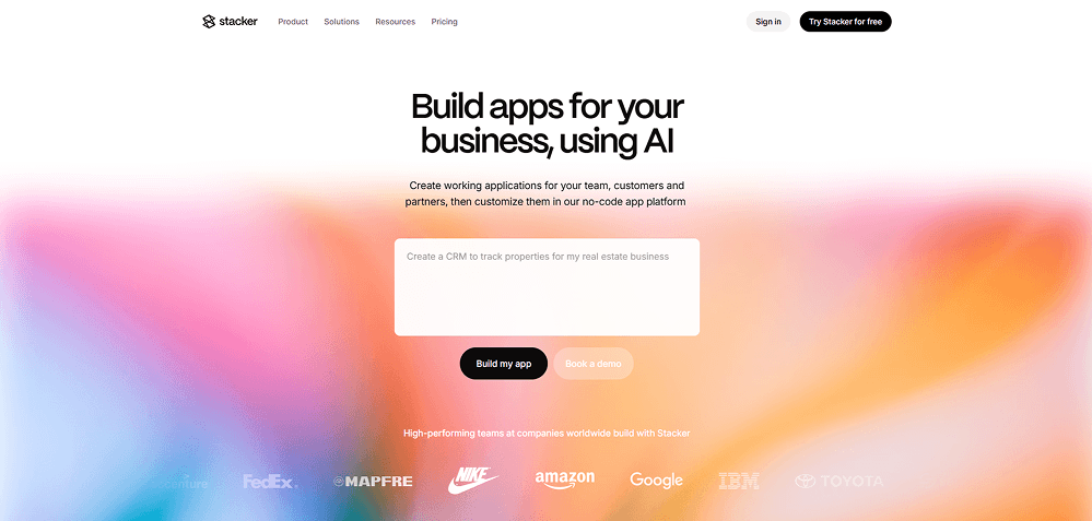
Stacker - Soft Gradient Hero With Clean, Minimal Typography
 Visit website
What You Can Learn From This Design
Stacker uses a dreamy, blurred gradient backdrop that adds warmth and personality while keeping the layout simple and spacious. The clean black typography and centered structure create strong clarity, allowing the soft color wash to act as the main visual signature.
Key Design Highlights
-
Dreamy Blurred Gradient - The soft pink-orange-blue blend adds emotion and instantly sets a modern, creative tone.Minimal Centered Layout - Clean alignment and plenty of white space make the hero easy to read and visually calm.Contrasting Black Typography - Bold black text stands out against the pastel background, creating a crisp, high-readability look.
Design & Technology Breakdown
-
Font Family
Sans-serif. -
Color Palette
-
Animations
Not specified -
CMS
WordPress
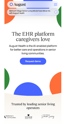
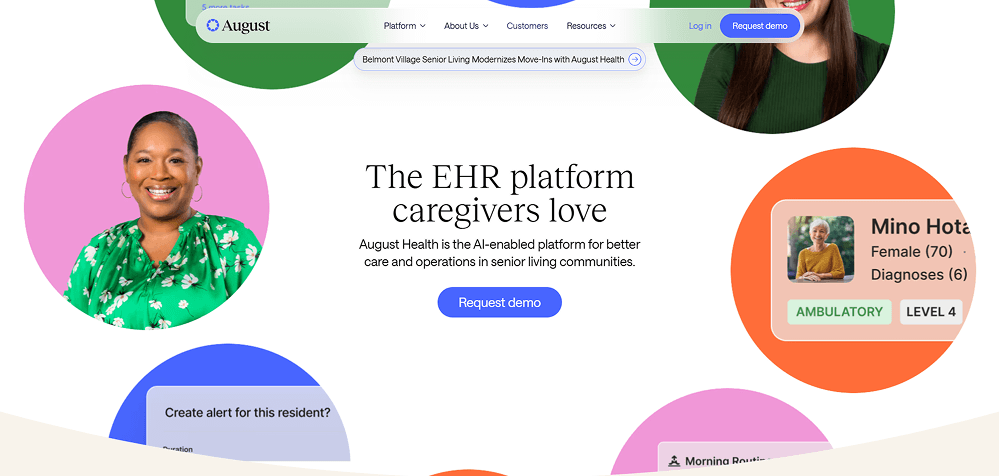
August Health - Warm, Human-Centered Design With Soft Circular Visuals
 Visit website
What You Can Learn From This Design
August Health uses colorful circular cutouts and welcoming portrait photography to build a warm, community-focused atmosphere. The soft shapes, gentle shadows, and clean serif typography create a friendly, supportive look that fits perfectly with caregiver-centered messaging.
Key Design Highlights
-
Colorful Circular Portraits - Large, vibrant circles featuring real people bring warmth and personality to the layout.Soft, Friendly Color Palette - Bright but gentle pinks, greens, blues, and oranges create an uplifting and approachable visual tone.Clean Serif Headline - Elegant typography adds trust and balances the playful circular elements with a professional feel.
Design & Technology Breakdown
-
Font Family
Saans, sans-serif. -
Color Palette
-
Animations
GSAP -
CMS
WordPress
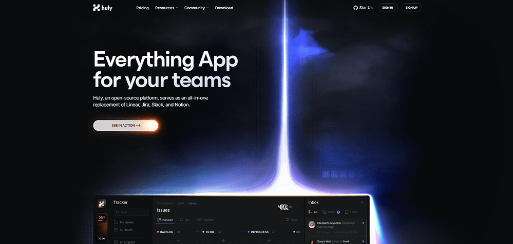
Huly - Futuristic, Neon-Driven Productivity Design
 Visit website
What You Can Learn From This Design
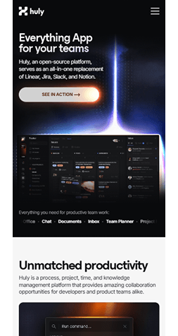
Huly mixes a sci-fi visual style with clear, practical UI patterns. The dark neon look stays consistent on mobile, where the layout simplifies for a smooth small-screen experience.
Key Design Highlights
-
Futuristic Visual Atmosphere - A dark, glowing interface with neon gradients that immediately stands out in the productivity category.Strong UI Hierarchy - Large typography, clear spacing, and subtle shadows make dense data feel organized and readable.Mobile-First Thoughtfulness - The mobile layout is compressed intelligently: navigation becomes cleaner, sections stack properly, and the sci-fi glow still feels immersive without overwhelming the screen.
Design & Technology Breakdown
-
Font Family
Ui-sans-serif,system-ui,sans-serif,Apple Color Emoji,Segoe UI Emoji,Segoe UI Symbol,Noto Color Emoji. -
Color Palette
-
Animations
Not specified -
CMS
Not specified
Evervault - Clean, Secure, Gradient-Rich Fintech Design
 Visit website
What You Can Learn From This Design
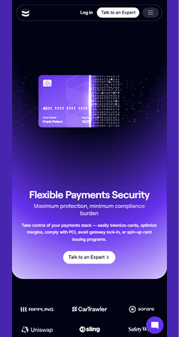
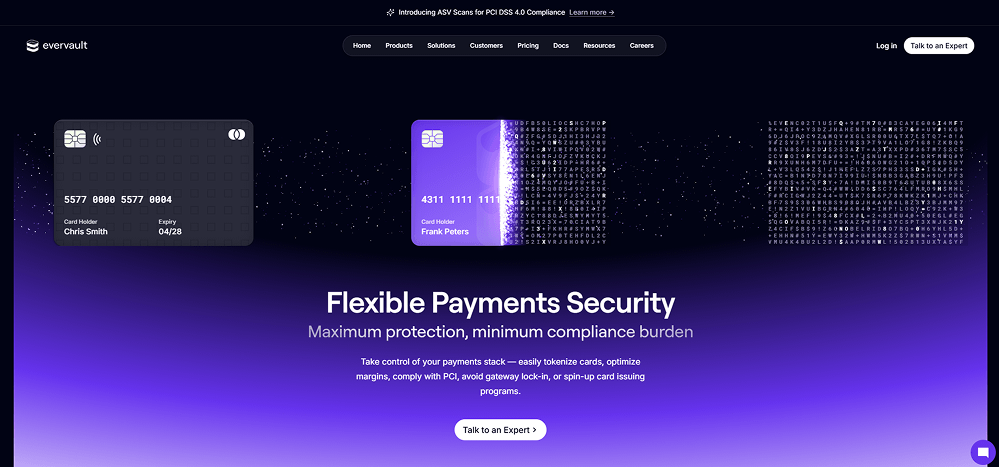
Evervault blends security-focused visuals with a smooth, modern interface. The encrypted-data animation, dark-to-purple gradients, and clean layout make complex fintech capabilities feel simple and trustworthy.
Key Design Highlights
-
Security-Driven Aesthetic - Subtle cipher animations and encrypted text instantly communicate trust and technical depth.Bold Gradient Hero - The black-to-purple transition creates a premium fintech feel while keeping the content highly readable.Minimal, Focused Layout - Clear spacing, simple typography, and centered messaging keep attention on the core value: secure payments.
Design & Technology Breakdown
-
Font Family
Apple-system, BlinkMacSystemFont, Segoe UI, Roboto, Oxygen. -
Color Palette
-
Animations
Not specified -
CMS
Not specified
#paid - Bold Typography and Personality-Driven Marketplace Design
 Visit website
What You Can Learn From This Design
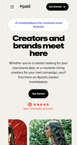
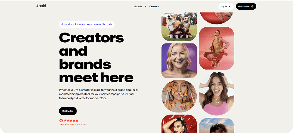
#paid uses oversized, confident typography paired with vibrant creator imagery to build instant personality. The design feels friendly and energetic while keeping the marketplace message clear and structured.
Key Design Highlights
-
Big, Confident Typography - Heavy, oversized headlines communicate clarity and strength without feeling corporate.Human-Centered Visuals - Colorful creator portraits form the visual identity, making the page feel authentic and alive.Minimal, Soft Layout - A neutral background, wide spacing, and rounded imagery balance the boldness and keep the flow easy to scan.
Design & Technology Breakdown
-
Font Family
Mona Sans, Georgia, sans-serif. -
Color Palette
-
Animations
Not specified -
CMS
WordPress
Free Web Accessibility checker
Enter your website URL to get a free, instant accessibility scan with tabnav's checker.
FeedSpring - A Clean, Gradient-Driven Design for Social Embed Tools
 Visit website
What You Can Learn From This Design
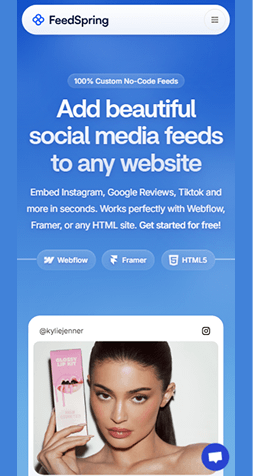
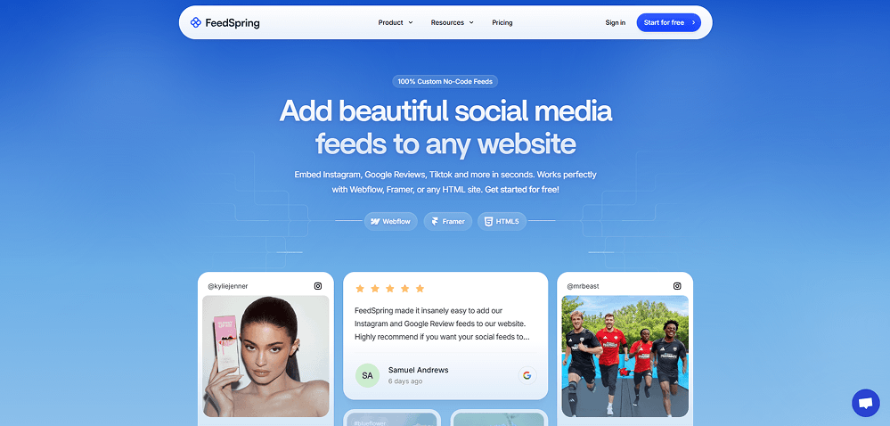
FeedSpring website example combines a soft blue gradient with smooth card components to create a light, trustworthy feel. The UI focuses on clarity and simplicity, making a technical product feel friendly and easy to adopt.
Key Design Highlights
-
Polished Gradient Hero - A smooth blue background paired with subtle lines gives the page a modern, elevated look.Card-Based Visual Storytelling - Real social posts and reviews are displayed in clean rounded cards, instantly communicating the product's purpose.Clear Product Positioning - Direct, centered messaging with lightweight typography helps visitors quickly understand what FeedSpring does.
Design & Technology Breakdown
-
Font Family
Inter, sans-serif. -
Color Palette
-
Animations
GSAP -
CMS
WordPress
Maggie - Bold, Playful Typography Wrapped in a Friendly Pastel World
 Visit website
What You Can Learn From This Design
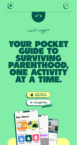
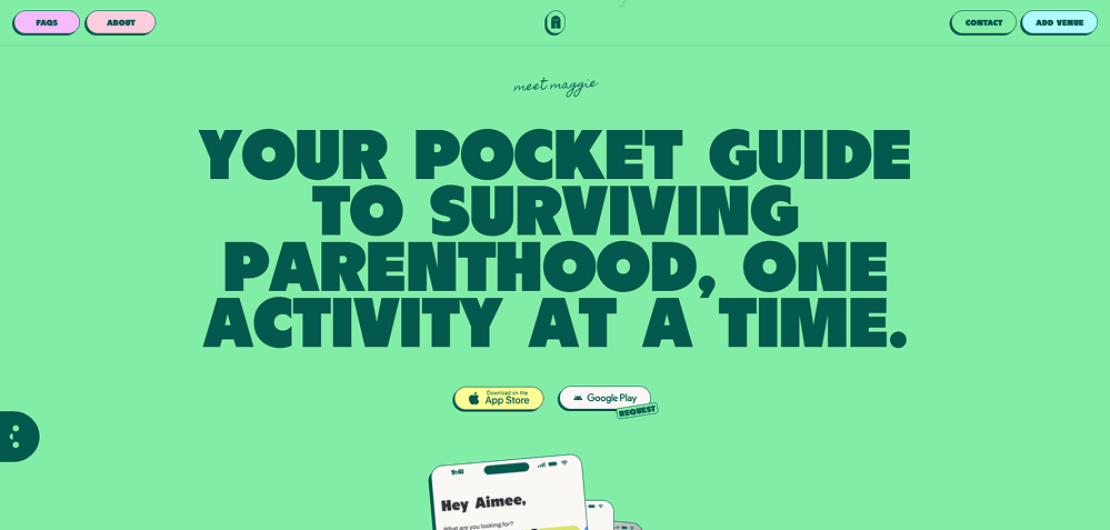
Maggie uses oversized, personality-filled typography and a bright pastel palette to create a warm, approachable tone. It feels fun without losing clarity - perfect for a parent-focused product that wants to stay energetic and supportive.
Key Design Highlights
-
Massive Statement Typography - Extra-bold, tightly packed type instantly grabs attention and sets a confident, playful voice.Soft Pastel Color Environment - A mint-green background paired with dark text creates a friendly, upbeat contrast that feels fresh and inviting.App-Centric Visual Focus - App store buttons and phone mockups are centered in the layout, reinforcing that this is a mobile-first experience.
Design & Technology Breakdown
-
Font Family
Sans-serif. -
Color Palette
-
Animations
GSAP -
CMS
WordPress
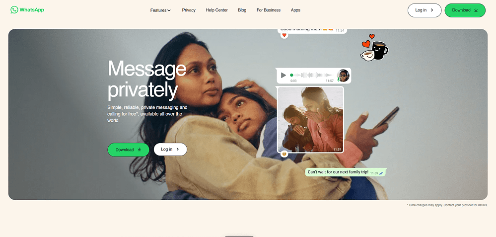
WhatsApp - Soft, Human-Centered Design That Feels Warm and Personal
 Visit website
What You Can Learn From This Design
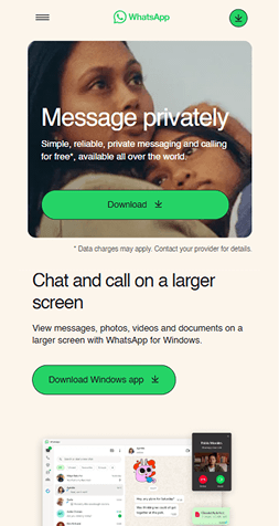
WhatsApp stands out as one of the best web design examples, mixing warm photography with minimal UI overlays for a calm, approachable feel. The layout is open and relaxed, helping the messaging features feel both accessible and emotionally driven.
Key Design Highlights
-
Warm, Human Photography - A full-bleed image focused on real people sets an emotional tone and reinforces WhatsApp's message of private, personal communication.Light, Understated Interface - Soft beige backgrounds, subtle shadows, and rounded elements make the UI feel gentle and unobtrusive.In-App Visual Overlays - Message bubbles, stickers, and audio clips float naturally over the hero image, instantly showing how the product works without feeling technical.
Design & Technology Breakdown
-
Font Family
Helvetica, Arial, sans-serif. -
Color Palette
-
Animations
Not specified -
CMS
Not specified
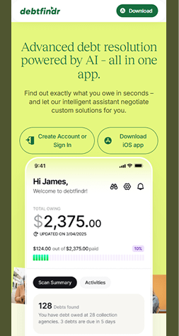
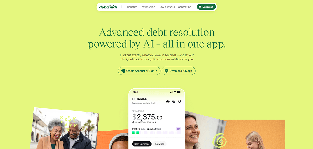
Debtfindr - A Calm, Confidence-Boosting Approach to Financial Stress
 Visit website
What You Can Learn From This Design
Debtfindr uses soft colors, friendly illustrations, and a clean UI to make a traditionally stressful topic feel approachable. The hero instantly communicates clarity and relief instead of pressure.
Key Design Highlights
-
Reassuring Color Palette - Soft greens and warm tones create a calm, optimistic atmosphere that reduces anxiety around finances.Friendly App Preview - A clear mobile mockup shows the exact numbers users can expect, making the product feel transparent and trustworthy from the first screen.Human-Centered Imagery - Smiling faces and doodle-style accents help turn a serious service into something personal and supportive, not intimidating.
Design & Technology Breakdown
-
Font Family
Adora Book, Arial, sans-serif. -
Color Palette
-
Animations
Not specified -
CMS
WordPress
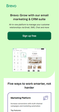
Brevo - Clean, Trust-Building Design for a Multi-Tool Marketing Platform
 Visit website
What You Can Learn From This Design
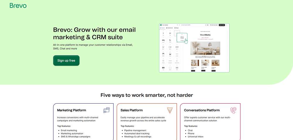
Brevo uses soft greens, rounded shapes, and a friendly visual tone to make a complex SaaS platform feel simple and approachable. The hero layout clearly shows both value and product capability without overwhelming the user.
Key Design Highlights
-
Clear Value Messaging - Straightforward copy and a calm layout immediately explain what the platform does and who it's for.Gentle, Friendly Aesthetic - Soft green tones, rounded edges, and balanced spacing create a welcoming first impression.Visual Product Proof - The editor mockup in the hero quickly communicates capabilities, making the product feel tangible from the start.
Design & Technology Breakdown
-
Font Family
Tomato-Grotesk-Regular, Verdana, sans-serif. -
Color Palette
-
Animations
Not specified -
CMS
WordPress
GenieStudio - Playful, Friendly Branding with Soft Motion & Floating Elements
 Visit website
What You Can Learn From This Design
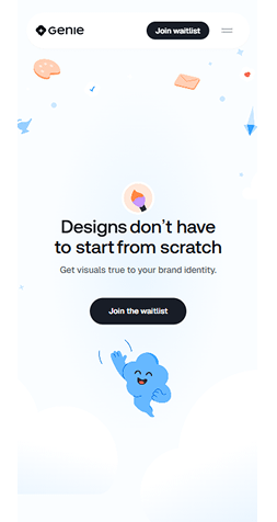
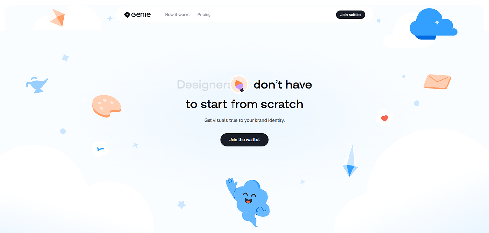
GenieStudio uses a light, airy aesthetic with floating illustrations and soft gradients to create a warm, friendly first impression. It communicates creativity without visual noise, making the hero section feel delightful and easy to read.
Key Design Highlights
-
Whimsical Visual Style - Soft clouds, floating icons, and gentle gradients create a playful, imaginative atmosphere.Clear, Focused Message - The headline is simple and benefit-driven, supported by a clean layout that avoids distractions.Inviting CTA - A bold, rounded button stands out against the light background, drawing attention without feeling salesy.
Design & Technology Breakdown
-
Font Family
Geist, sans-serif. -
Color Palette
-
Animations
GSAP -
CMS
WordPress
RobinAI - A Calming, Hand-Painted Hero That Softens Complex Legal Tech
 Visit website
What You Can Learn From This Design
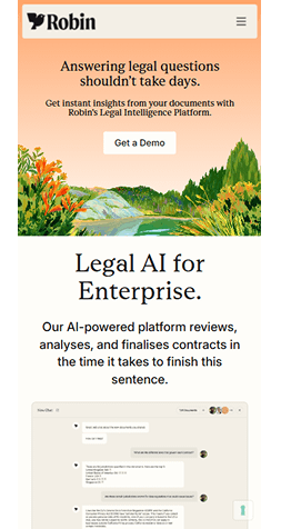
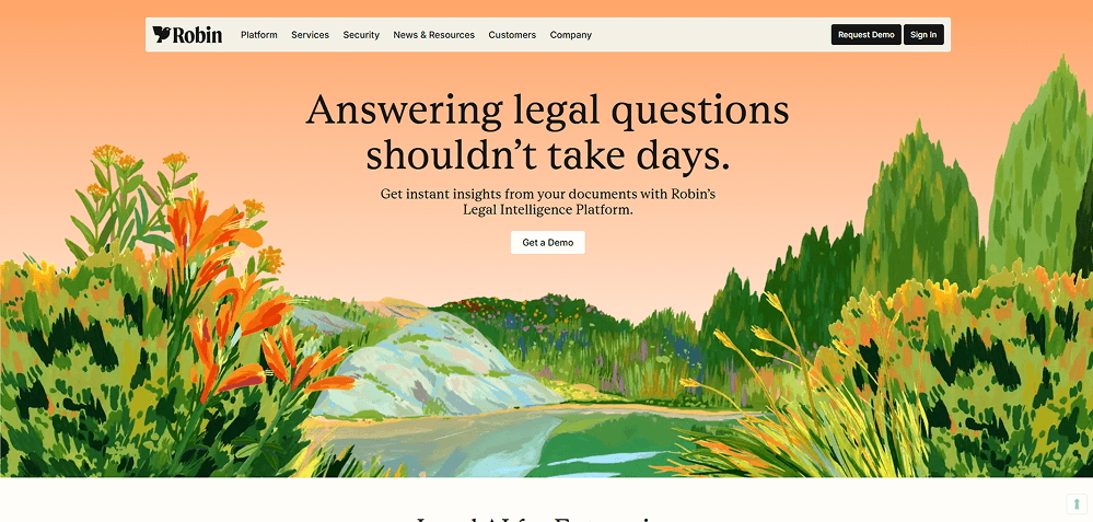
RobinAI uses a warm, illustrated landscape to make legal technology feel more approachable. The serene visuals balance the seriousness of the product, helping users feel welcomed rather than overwhelmed.
Key Design Highlights
-
Human, Artistic Hero - A hand-painted scene creates warmth and trust, breaking the typical corporate legal-tech look.Clear Value Statement - The headline is bold and direct, immediately addressing the core problem: slow legal answers.Soft, Warm Palette - Gradients of peach, green, and orange create a calm atmosphere while keeping the interface modern.
Design & Technology Breakdown
-
Font Family
Inter, sans-serif. -
Color Palette
-
Animations
Not specified -
CMS
WordPress
Neon - A Futuristic Database UI With Motion, Depth, and Pure Focus
 Visit website
What You Can Learn From This Design
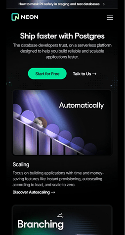
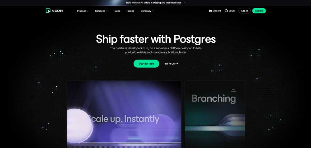
Neon blends a sci-fi visual atmosphere with a hyper-clean product pitch. The dark, dotted backdrop and glowing accents create a sense of speed and innovation while keeping the hero message laser-focused on developers.
Key Design Highlights
-
Striking Futuristic Atmosphere - A deep black background with glowing micro-dot patterns feels fast, technical, and modern.High-Impact Hero Message - Short, bold typography (“Ship faster with Postgres”) instantly communicates value.Motion-Driven Visual Storytelling - Animated cards below the hero use soft blurs, light streaks, and smooth gradients to reinforce speed and scalability.
Design & Technology Breakdown
-
Font Family
Ui-sans-serif, system-ui, sans-serif, Apple Color Emoji, Segoe UI Emoji, Segoe UI Symbol, Noto Color Emoji. -
Color Palette
-
Animations
GSAP -
CMS
Not specified
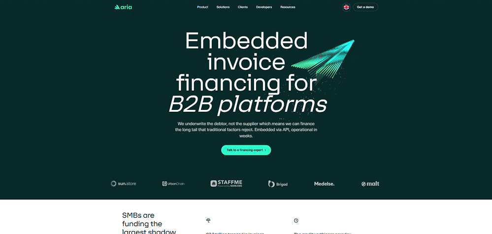
Aria - Clean Fintech Design With a Technical, High-Trust Edge
 Visit website
What You Can Learn From This Design
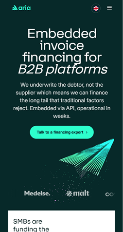
Aria's deep, minimal interface and dynamic 3D line-animation make it a strong fit among good website design examples. The bold typography and spacious layout keep complex B2B messaging clear and digestible.
Key Design Highlights
-
High-Trust Fintech Look - A dark teal background and bright mint accents create a professional, confident atmosphere without feeling heavy.Striking 3D Motion Element - The animated arrow made of particle lines adds movement and instantly communicates speed and direction.Clear, Bold Messaging - Large serif and sans-serif typography work together to highlight the main value proposition for B2B platforms.
Design & Technology Breakdown
-
Font Family
STKBureau, system-ui, -apple-system, Segoe UI, Roboto. -
Color Palette
-
Animations
Not specified -
CMS
WordPress
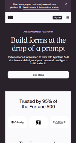
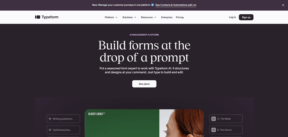
Typeform - A Polished, Editorial UI With a Strong AI-Focused Message
 Visit website
What You Can Learn From This Design
Typeform blends editorial typography with a dark, velvety color palette that feels premium and modern. The hero headline is bold and spacious, letting the message stand out while subtle UI elements preview the product in action.
Key Design Highlights
-
High-End Editorial Typography - The large serif headline gives the page a magazine-like feel, making the AI features look sophisticated and trustworthy.Deep, Minimal Color Palette - Rich charcoal tones paired with clean white accents make the layout feel refined and uncluttered.Real Product Context - The embedded form preview shows how Typeform's AI structures questions, helping users immediately visualize the value.
Design & Technology Breakdown
-
Font Family
Arial, sans-serif. -
Color Palette
-
Animations
GSAP -
CMS
WordPress
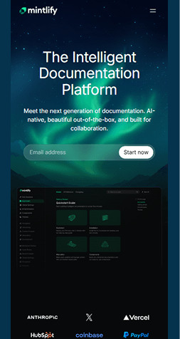
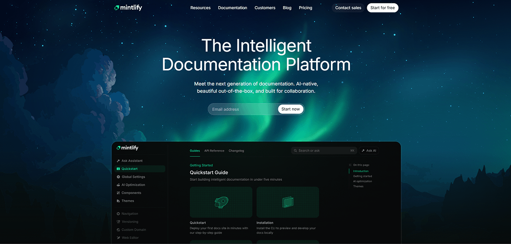
Mintlify - A Futuristic, Aurora-Inspired UI for Developer Documentation
 Visit website
What You Can Learn From This Design
Mintlify uses a cinematic aurora backdrop and precise UI styling to make documentation feel modern, intelligent, and enjoyable. The mix of glowing gradients, dark mode UI, and clean typography creates a developer-first experience that looks both premium and highly functional.
Key Design Highlights
-
Aurora-Style Visual Atmosphere - The hero section uses soft, glowing greens and blues that create an immersive, futuristic feel while keeping the content readable.Developer-Focused Dark UI - The documentation preview uses a dark dashboard layout with sharp icons and tidy spacing, mirroring tools engineers already trust.Integrated AI Elements - Features like “Ask AI” and smart search are visually understated yet clear, reinforcing the platform's intelligence without overwhelming the interface.
Design & Technology Breakdown
-
Font Family
inter,inter Fallback. -
Color Palette
-
Animations
Not specified -
CMS
WordPress
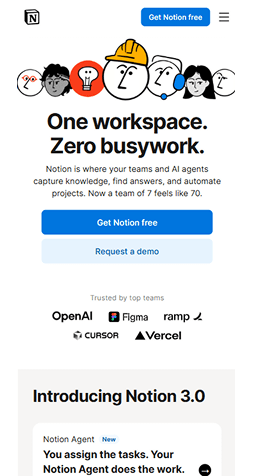
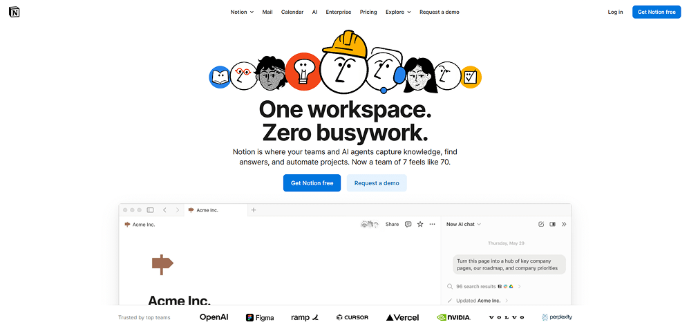
Notion - Minimalist Productivity With Personality
 Visit website
What You Can Learn From This Design
Notion pairs ultra-clean layouts with playful character illustrations to create a workspace that feels friendly without losing its professional edge. The balance of strong typography, white space, and subtle motion keeps the interface intuitive and welcoming.
Key Design Highlights
-
Friendly Visual Identity - Hand-drawn character icons add warmth and approachability, making the product feel less like software and more like a team companion.Bold, Clear Messaging - Large headlines with simple, confident language instantly communicate what the product does and why it matters.Interface Previews That Feel Real - Live-style product windows show Notion in action, helping users imagine how it fits into their workflow.
Design & Technology Breakdown
-
Font Family
Helvetica, Apple Color Emoji, Arial, sans-serif, Segoe UI Emoji, Segoe UI Symbol. -
Color Palette
-
Animations
Not specified -
CMS
Not specified
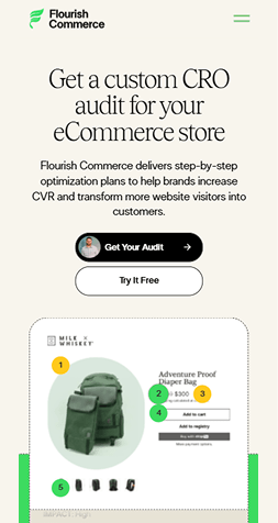
Flourish Commerce - Clean, Trust-Building CRO Design
 Visit website
What You Can Learn From This Design
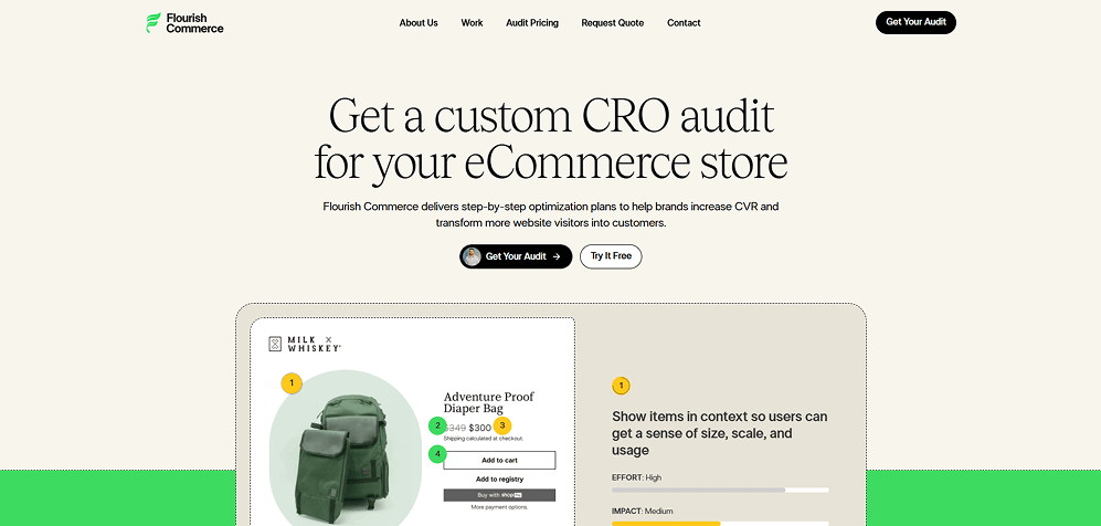
Flourish Commerce uses a refined, editorial layout to communicate expertise and build instant trust. The soft color palette, serif typography, and structured content blocks make a technical service feel approachable and premium.
Key Design Highlights
-
Editorial Aesthetic - Large serif headlines and generous spacing create a polished, magazine-like feel that elevates the brand.Clear Value Presentation - The hero message is straightforward, while supporting text explains the service without clutter or jargon.Real Audit Examples - Visual callouts and annotated screenshots show exactly what clients can expect, adding transparency and credibility.
Design & Technology Breakdown
-
Font Family
LTSuperior, Arial, sans-serif. -
Color Palette
-
Animations
Not specified -
CMS
WordPress
OSMO - Dev Toolkit With Personality and Motion
 Visit website
What You Can Learn From This Design
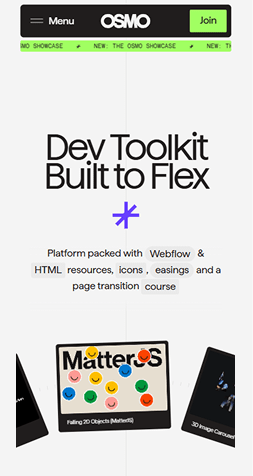
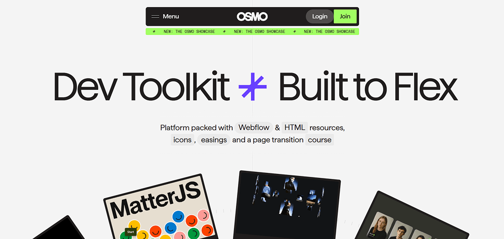
OSMO website example blends a bold developer-centric identity with playful motion and standout typography. The result is a site that feels technical yet expressive, making tools and resources instantly appealing.
Key Design Highlights
-
High-Impact Typography - Oversized, ultra-clean headlines paired with quirky glyphs create a memorable, developer-friendly visual signature.Dynamic Hero Layout - Rotated cards, floating assets, and subtle movement give the page an energetic, flexible feel that matches the brand's message.Neon Accent System - The electric green highlights and dark UI elements draw attention to CTAs and the platform's core value without overwhelming the clean layout.
Design & Technology Breakdown
-
Font Family
Haffer VF, Arial, sans-serif. -
Color Palette
-
Animations
GSAP -
CMS
Not specified
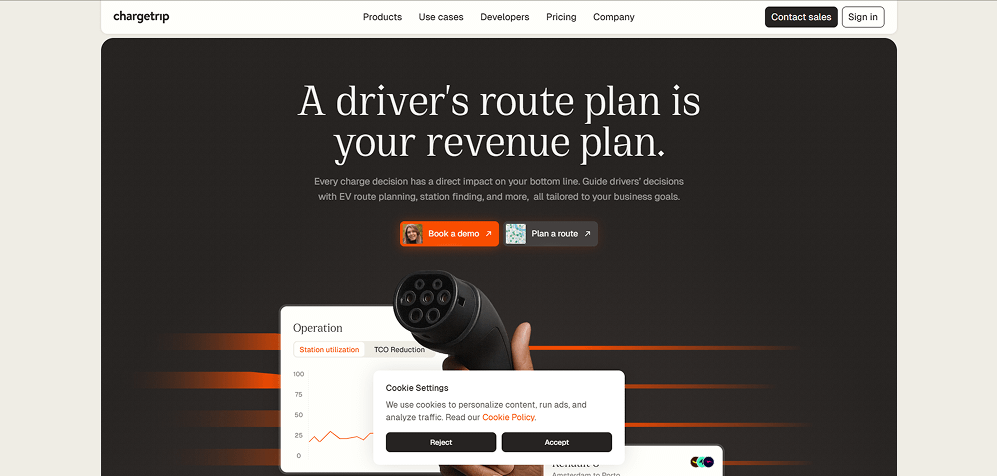
Chargetrip - Minimalist Dark Hero With Motion-Inspired Energy
 Visit website
What You Can Learn From This Design
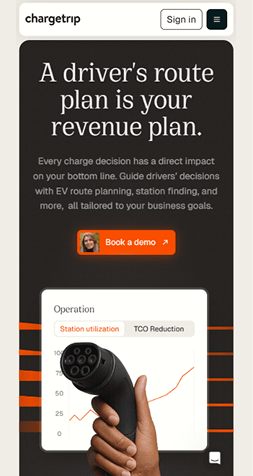
Chargetrip mixes a calm, editorial look with subtle motion-inspired elements - a great source of website design ideas that communicate trust, precision, and advanced EV technology without overwhelming the user.
Key Design Highlights
-
Premium Dark Hero - A deep charcoal background paired with clean serif typography creates a high-end, enterprise-focused visual tone.Human-Centered Product Imagery - The combination of a real hand and charging connector adds warmth and clarity, grounding the technology in real-world use.Motion Lines for Energy & Direction - The orange horizontal streaks subtly reference EV routes and movement, tying the visual style directly to the product's purpose.
Design & Technology Breakdown
-
Font Family
Cirka Regular", Cirka Regular Placeholder, sans-serif. -
Color Palette
-
Animations
Emotion -
CMS
Not specified
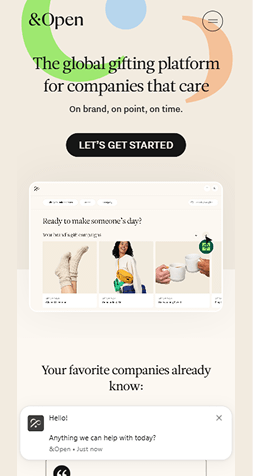
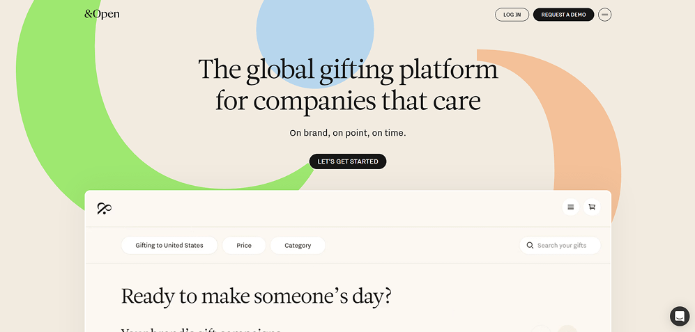
&Open - Soft Pastel Hero With Friendly, Feel-Good Brand Energy
 Visit website
What You Can Learn From This Design
&Open uses warm color gradients, gentle curves, and clean editorial typography to create a welcoming, human-centered brand experience that instantly communicates thoughtfulness and care.
Key Design Highlights
-
Playful Organic Shapes - Oversized pastel arcs bring movement and friendliness to the hero section, setting a mood of generosity and ease.Editorial Serif Headline - The elegant serif type communicates trust and quality, perfect for a premium gifting platform.Warm Neutral Background - Soft beige tones keep the interface calm and sophisticated while letting the brand colors pop without feeling loud.
Design & Technology Breakdown
-
Font Family
Helvetica,Arial,sans-serif. -
Color Palette
-
Animations
Not specified -
CMS
WordPress
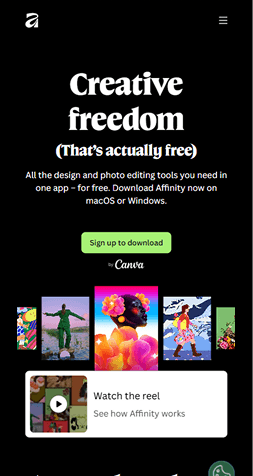
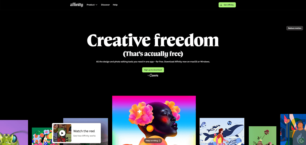
Affinity - Bold Black Hero With Museum-Style Typography & Showcase Imagery
 Visit website
What You Can Learn From This Design
Affinity uses a dramatic black canvas paired with elegant serif typography and vibrant artwork to create a premium, gallery-like experience that spotlights creativity and pulls users straight into the visual world of the product.
Key Design Highlights
-
Gallery-Style Hero - The full-black background and oversized serif title create a dramatic, museum-like first impression.High-Contrast Typography - Thick white type against a deep black canvas gives the headline instant impact and perfect readability.Vibrant Artwork Showcase - Bright illustrations and photos pop off the dark backdrop, turning the homepage into a creative visual reel.
Design & Technology Breakdown
-
Font Family
Affinity Serif Variable", Canva Sans, Noto Sans Variable, Noto Sans. -
Color Palette
-
Animations
Not specified -
CMS
Not specified
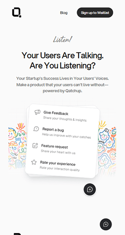
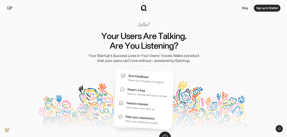
Qatchup - Clean Grid Layout With Playful Hand-Drawn Illustrations
 Visit website
What You Can Learn From This Design
Qatchup blends a clean, minimal interface with colorful hand-drawn illustrations to create a friendly, human-centered feel. The grid backdrop and soft shadows give structure, while the playful artwork adds personality without hurting clarity.
Key Design Highlights
-
Friendly Illustration Style - Hand-drawn characters add warmth and approachability, making a feedback tool feel fun and inviting.Structured Grid Background - The light grid pattern gives the layout quiet structure, helping text and cards stay neatly organized.Soft, Layered Card UI - Floating cards with subtle shadows create depth and guide the eye toward the main actions.
Design & Technology Breakdown
-
Font Family
Aspekta, Arial, sans-serif. -
Color Palette
-
Animations
Not specified -
CMS
WordPress
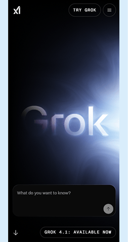
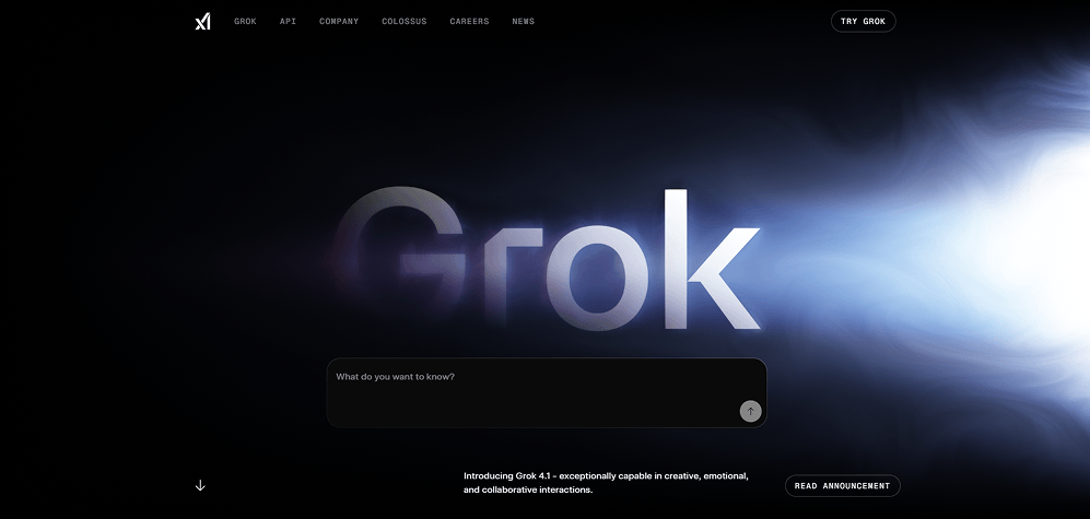
Grok - Futuristic Dark UI with Cinematic Energy Effects
 Visit website
What You Can Learn From This Design
Grok uses a dramatic dark interface with glowing energy light effects to create a powerful, cinematic hero moment. The oversized typography and atmospheric gradients give the brand a mysterious, high-tech presence while keeping the layout clean and focused.
Key Design Highlights
-
Cinematic Atmosphere - Deep blacks paired with swirling blue-white energy effects create a dramatic, sci-fi visual tone that immediately grabs attention.Oversized Statement Typography - The huge “Grok” title with soft glow and blur effects anchors the entire hero section and sets a bold, confident tone.Minimal UI with High Contrast - Small, clean navigation and a centered input box keep the interface simple, letting the lighting and typography take the spotlight.
Design & Technology Breakdown
-
Font Family
Liberation Mono,DejaVu Sans Mono,Courier New,monospace. -
Color Palette
-
Animations
Not specified -
CMS
Not specified
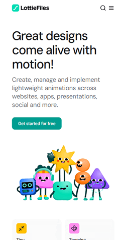
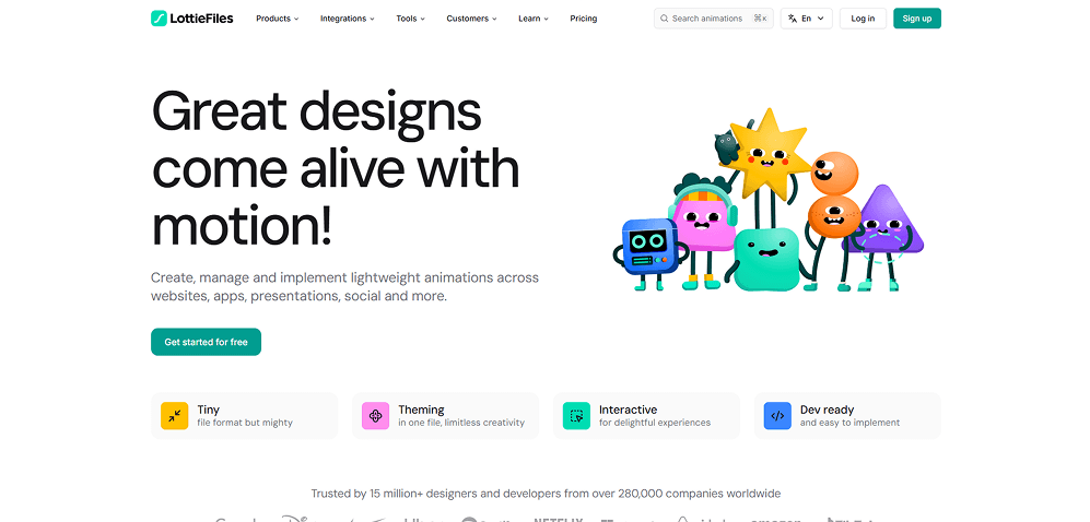
LottieFiles - Friendly Motion-First Design with Playful Character Illustrations
 Visit website
What You Can Learn From This Design
LottieFiles uses cheerful characters, bold typography, and a clean white layout to communicate motion, creativity, and ease of use. The hero instantly conveys what the product does-making animations fun, lightweight, and developer-friendly.
Key Design Highlights
-
Playful Character Illustrations - Bright, friendly mascots visually reinforce the product's focus on animation and make the page feel energetic and approachable.Bold, Simple Typography - Large, clean headline text delivers the core message fast while keeping the interface modern and easy to scan.Colorful Feature Blocks - Soft pastel badges with icons add structure to the content and make the core feature set digestible at a glance.
Design & Technology Breakdown
-
Font Family
"Inter", sans-serif. -
Color Palette
-
Animations
Not specified -
CMS
Not specified
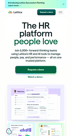
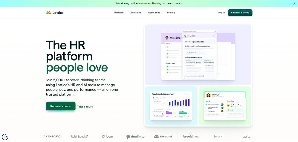
Lattice - Soft, Trust-Driven HR Design with Calm Colors and Friendly UI Cards
 Visit website
What You Can Learn From This Design
Lattice blends warm gradients, soft illustrations, and approachable UI mockups to create a trustworthy HR brand. The design feels human-centered, highlighting ease of use while keeping everything clean, structured, and modern.
Key Design Highlights
-
Calming Pastel Color System - Soft mint, lavender, and teal tones reduce visual stress and create a friendly, HR-focused atmosphere that feels supportive and welcoming.UI-First Storytelling - Floating product screenshots with rounded cards instantly show how the platform works, making complex HR tools feel simple and approachable.Clean, Confident Typography - Large, spacious headlines paired with thin subtext communicate clarity and professionalism without feeling corporate or cold.
Design & Technology Breakdown
-
Font Family
Matter,sans-serif. -
Color Palette
-
Animations
GSAP -
CMS
Not specified
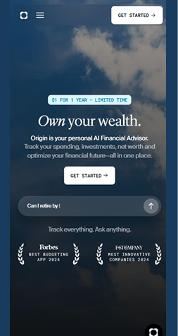
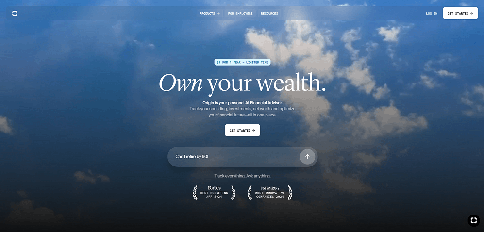
Origin - Elegant Financial Design with Cinematic Gradients and Calm Atmosphere
 Visit website
What You Can Learn From This Design
Origin uses a cinematic sky backdrop, refined typography, and soft glassmorphism to make financial planning feel clear, calm, and aspirational - not stressful or technical.
Key Design Highlights
-
Cinematic Sky Background - A full-screen moving sky gradient sets a peaceful, aspirational tone that instantly separates the brand from traditional finance websites.Editorial Serif Typography - The large, graceful headline font adds a premium, advisory feel while keeping the message simple and emotionally focused.Glassmorphic Input & UI - Soft, translucent cards and rounded controls modernize the interface and reinforce the sense of clarity and ease in financial decision-making.
Design & Technology Breakdown
-
Font Family
Matter,sans-serif. -
Color Palette
-
Animations
GSAP -
CMS
Not specified
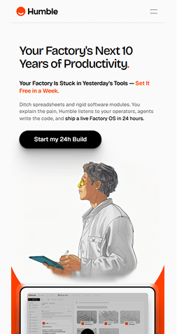
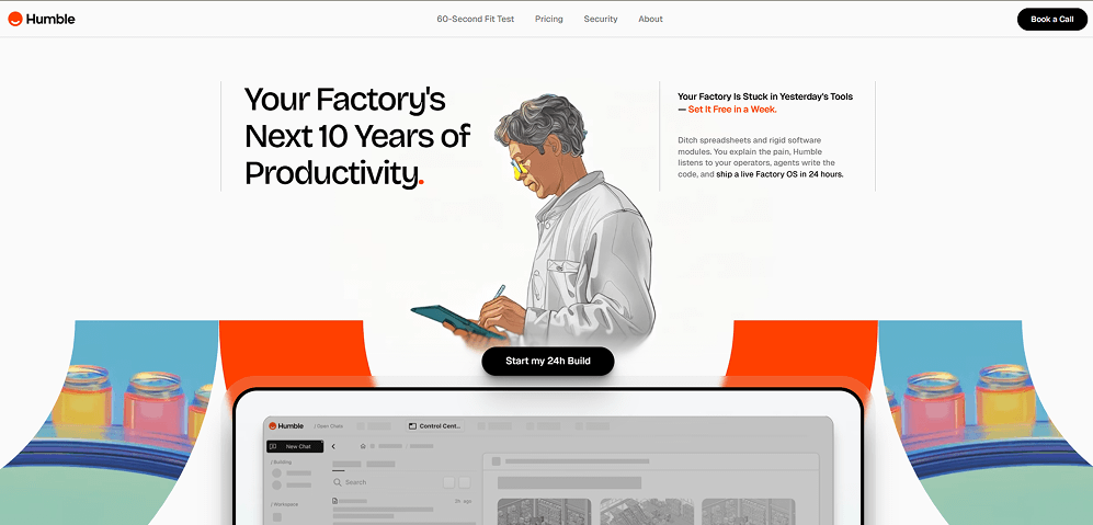
Humble - Industrial Minimalism with Bold Shape-Driven Visuals
 Visit website
What You Can Learn From This Design
Humble blends clean enterprise minimalism with bold, curved color blocks and illustrated characters to make factory software feel approachable, modern, and human-centered.
Key Design Highlights
-
Shape-Driven Hero Layout - Large curved color bands frame the interface, adding movement and personality while breaking the traditional SaaS layout pattern.Editorial Illustration Style - The hand-drawn technician adds warmth and humanity, helping a complex industrial product feel simple and relatable.Strong, Minimal Typography - Bold headlines with generous spacing keep the message clear and powerful, balancing the more expressive visual elements.
Design & Technology Breakdown
-
Font Family
Bricolage Grotesque, Bricolage Grotesque Placeholder, sans-serif. -
Color Palette
-
Animations
Lenis -
CMS
WordPress
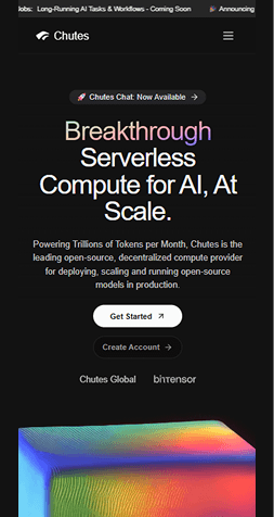
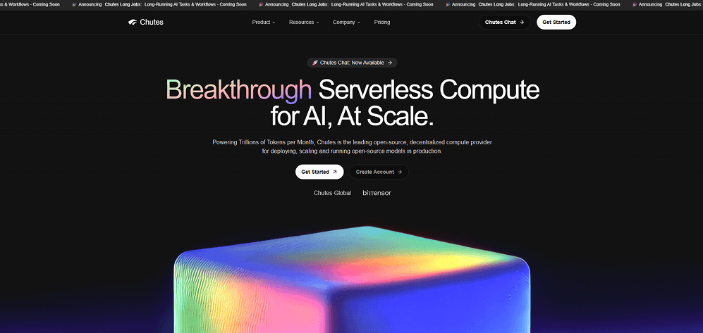
Chutes - Futuristic Minimalism with High-Gloss, Sci-Fi Visual Energy
 Visit website
What You Can Learn From This Design
Chutes uses cinematic gradients, heavy contrast, and a glowing 3D object to communicate scale, intelligence, and next-gen infrastructure power without clutter.
Key Design Highlights
-
Gradient Spectrum Typography - The multicolor headline instantly signals innovation and gives the hero a futuristic, cutting-edge identity.Cinematic 3D Centerpiece - The glowing cube with soft, tactile edges creates a strong visual anchor that communicates compute power and digital fluidity.Ultra-Dark Minimal Layout - Heavy black backgrounds and generous whitespace keep focus on the hero elements while reinforcing a premium, high-performance brand tone.
Design & Technology Breakdown
-
Font Family
Tomato Grotesk,sans-serif. -
Color Palette
-
Animations
Not specified -
CMS
Not specified
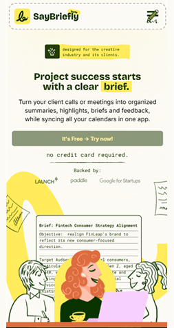
SayBriefly - Soft Minimalism With Playful Highlights and Editorial Clarity
 Visit website
What You Can Learn From This Design
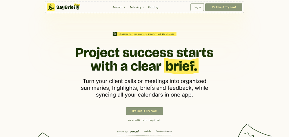
SayBriefly blends friendly typography, gentle textures, and hand-drawn details to create a warm, approachable SaaS identity that still feels organized and professional.
Key Design Highlights
-
Friendly Editorial Typography - Bold, rounded headlines paired with spacious body text give the layout a confident but conversational tone.Hand-Drawn Highlight Accents - The yellow brushstroke effect under key words adds personality and guides the eye naturally across the hero content.Soft Organic Background Glow - Subtle gradient rings behind the content create depth and warmth while keeping the interface clean and lightweight.
Design & Technology Breakdown
-
Font Family
Inter, sans-serif. -
Color Palette
-
Animations
GSAP -
CMS
Not specified
KINHIVE - Editorial Photography With Warm, Human-Centered Storytelling
 Visit website
What You Can Learn From This Design
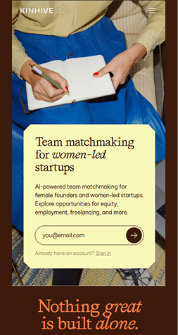
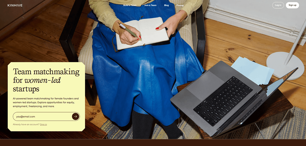
KINHIVE uses strong lifestyle photography and soft vintage tones to create a warm, authentic experience that immediately communicates community, trust, and purpose.
Key Design Highlights
-
Friendly Editorial Typography - Bold, rounded headlines paired with spacious body text give the layout a confident but conversational tone.Warm Cream Card UI - The rounded, soft-corner hero box adds comfort and readability while contrasting beautifully against the rich photo background.Editorial Serif Headline - The elegant serif type paired with italic accents brings a magazine-like sophistication that aligns with a women-led, community-focused brand.
Design & Technology Breakdown
-
Font Family
Affairs. -
Color Palette
-
Animations
Not specified -
CMS
WordPress
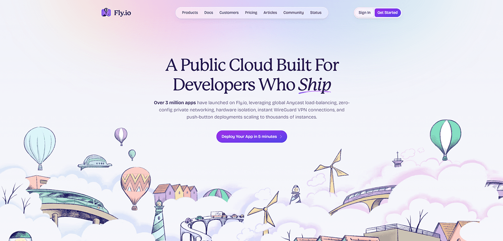
Fly.io - Playful Hand-Drawn Worlds With a Soft Gradient Cloud Aesthetic
 Visit website
What You Can Learn From This Design
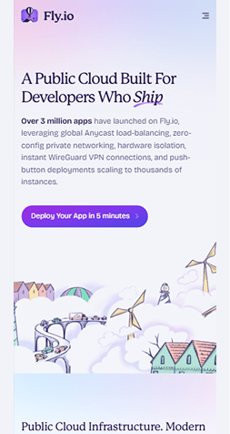
Fly.io blends developer-focused messaging with playful illustrated scenery, creating a friendly, story-driven experience that makes technical infrastructure feel approachable and fun.
Key Design Highlights
-
Hand-Drawn Illustrations - The whimsical balloons, clouds, and cityscapes create a memorable visual identity that stands out in a crowded dev-tool market.Soft Pastel Gradient Hero - The gentle pink-to-blue sky gradient adds warmth and depth, helping the headline feel light, calm, and inviting.Editorial Serif Typography - The elegant serif headline with purple underline accents adds personality, giving the brand a confident yet creative tone.
Design & Technology Breakdown
-
Font Family
Fricolage Grotesque, ui-sans-serif, system-ui,. -
Color Palette
-
Animations
Not specified -
CMS
WordPress
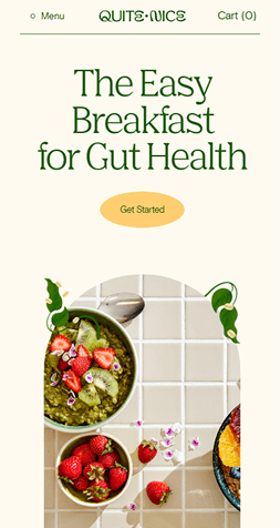
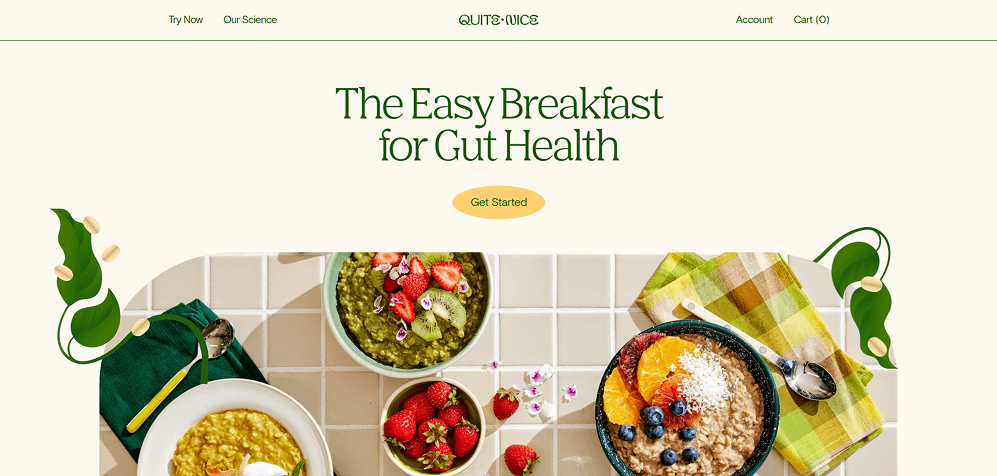
Quite Nice - Fresh, Bright Wellness Aesthetic With Natural Food Styling
 Visit website
What You Can Learn From This Design
Quite Nice uses warm, food-forward visuals and soft natural colors to create a friendly, health-positive experience that feels both credible and delicious.
Key Design Highlights
-
Sunlit Food Photography - The overhead breakfast shots with real textures and bright produce immediately build appetite appeal and trust.Calming Cream Background - The off-white canvas keeps the layout airy and highlights the colorful bowls and ingredients.Organic Illustrations - The leafy side graphics with floating capsules reinforce the wellness theme without overwhelming the hero area.
Design & Technology Breakdown
-
Font Family
Basis Grotesque Pro, Helvetica Neue LT Std. -
Color Palette
-
Animations
Not specified -
CMS
Shopify
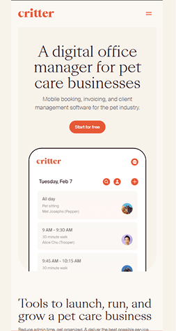
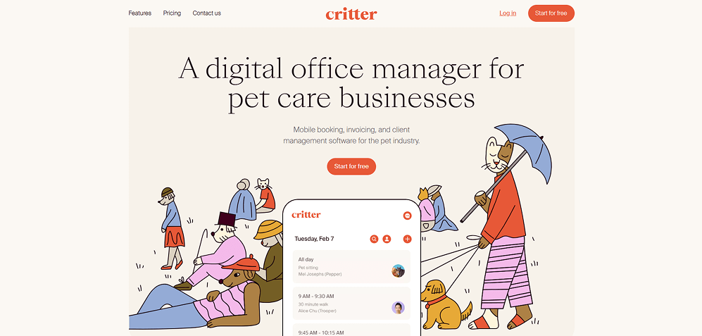
Critter - Playful Illustrations With a Warm, Pet-Centered Interface
 Visit website
What You Can Learn From This Design
Critter blends charming character art with a calm, soft layout to create a friendly, service-focused experience tailored to pet care businesses.
Key Design Highlights
-
Hand-Drawn Character Style - The animal caretakers and pets add warmth and personality, making the software feel approachable.Soft Neutral Palette - Beige and warm tones keep the interface gentle, letting the illustrations and primary CTA stand out.Floating App Preview - The centered mobile UI mockup clearly shows real scheduling features while staying integrated with the illustrated scene.
Design & Technology Breakdown
-
Font Family
Suissev Int'l, sans-serif. -
Color Palette
-
Animations
GSAP -
CMS
WordPress
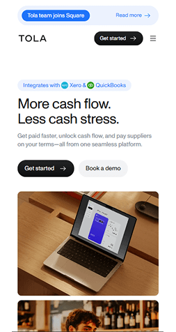
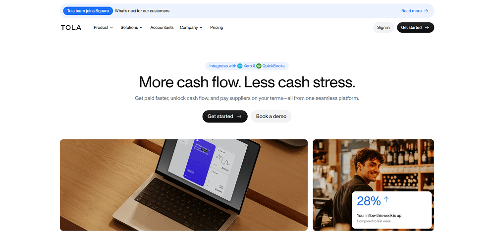
Tola - Clean Finance UX With Retail-Friendly Visual Storytelling
 Visit website
What You Can Learn From This Design
Tola blends a minimal financial UI with warm, real-world photography - a strong reminder of why it appears in the best website designs list. It makes cash-flow tools feel more human and accessible to small businesses.
Key Design Highlights
-
Ultra-Minimal Hero Layout - A bold, centered headline and generous white space create instant clarity around the product's value.Real Business Imagery - Photos of laptops and shop owners make the platform feel grounded in day-to-day retail operations.Soft Micro-Badges - Integrations with Xero and QuickBooks are shown with gentle pill-style badges that add trust without clutter.
Design & Technology Breakdown
-
Font Family
Noto Sans,Helvetica,Arial,sans-serif,Apple Color Emoji,Segoe UI Emoji. -
Color Palette
-
Animations
Not specified -
CMS
WordPress
Key Trends in Website Design for 2026
- Clean, distraction-free layouts. Minimal interfaces that focus on clarity and ease of use.
- High-contrast typography. Readable type that improves accessibility and visual hierarchy.
- Motion used with purpose. Small animations that support user flow rather than overwhelm it.
- Human-centered storytelling. Designs that guide users through clear narratives.
- Accessibility-first design. WCAG-aligned patterns that make the experience usable for everyone.
How to Use These Website Examples to Improve Your Own Site
- Use fewer colors with more contrast.
- Improve spacing and visual breathing room.
- Reduce noise and unnecessary elements.
- Make buttons clear, bold, and predictable.
- Test your layout on both mobile and desktop.
- Add micro-interactions where they help users.
- Run accessibility checks to boost usability.
If you work in Figma, there is a simple way to put this into practice. The HTML to Design plugin lets you pull any live website into your file, so you can inspect spacing, break down patterns, and rebuild layouts in your own style. It is a fast way to study real interfaces and turn inspiration into something you can actually use.
If you want to see how it works in action, here is a short video explanation .
How Top Designers Really Find Website Inspiration
When speaking with dozens of product and brand designers, we heard the same thing again and again: the best ideas come from studying real websites, not just mood boards.
They focus on structure, spacing, hierarchy, and how the experience actually feels to use - often guided by principles from the Psychology of Website Design.
Many designers also step away from the screen. They get website design ideas from photography, gallery visits, posters, and museum exhibits. Colors, textures, and layouts from offline visuals often shape their next digital project.Video Overview of 2026 Web Design Trends
If you prefer learning visually, here's a quick video that explains the key web design trends shaping 2026. It covers layout patterns, typography shifts, interaction styles, and the influence of AI on modern UI/UX.
We like this video because it's clear, practical, and aligns perfectly with the examples in this guide.
Bringing It All Together
Modern web design in 2026 goes far beyond aesthetics. It's about creating fast, intuitive, accessible experiences that feel effortless for users. If you apply the patterns shown across these examples, you'll build best websites pages that look great and perform even better.

Hello! I'm Eli Dror
Passionate about modern UI/UX trends. Specializes in WCAG audits, accessible design, and inclusive user experience strategies.
@elielidror
 Book a demo
-


