ADA Compliant Website Examples That Get Accessibility Right
Updated on January 11, 2026

If you're looking for ADA compliant website examples, you're likely trying to understand what accessibility looks like on real websites, not in theory.
Many sites claim to be accessible, but everyday use tells a different story. Keyboard navigation breaks, mobile layouts behave differently than desktop, or basic actions become hard to complete.
The examples below focus on websites that stay accessible across both desktop and mobile views. They show what works when accessibility is built into the structure of a site, not added later as a quick fix.
What Makes a Website ADA Compliant
In the United States, website accessibility falls under the Americans with Disabilities Act. While the ADA does not define technical requirements, courts consistently reference the Web Content Accessibility Guidelines as the standard for accessibility.
In practice, ADA compliance focuses on whether people with disabilities can:
- Navigate using a keyboard
- Understand content with a screen reader
- Complete key actions like forms and checkout
- Read and interact with content across devices
ADA compliant websites are built around usability, not just checklists.
Free Web Accessibility Checker
Enter your website URL to get a free, instant accessibility scan with tabnav's checker.

How We Selected ADA Compliant Website Examples Across Industries
We studied five websites from different industries to understand how accessibility works in real situations. Issues don't appear the same way on every site, so looking at only one type of website never tells the full story.
Each site represents a different context, from complex user flows to content-heavy pages and mobile navigation. This helps surface real patterns, not just theoretical guidelines.
These findings are based on hands-on studies. From each example, there's at least one practical improvement you can apply to your own site today.
ADA Compliant Website Examples by Industry
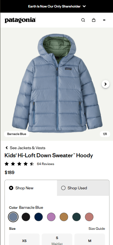
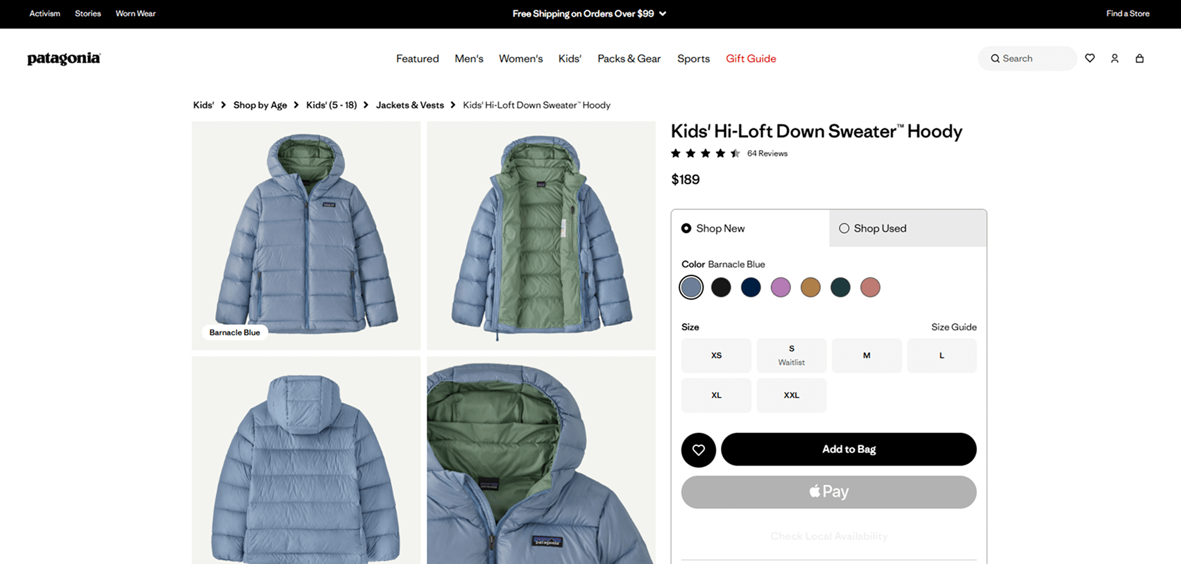
E-Commerce Website Example: Patagonia
Quick summary
This example focuses on a product page, one of the most critical pages on any e-commerce site. It's where all marketing efforts eventually lead and where accessibility issues can directly block a purchase.
Patagonia's product page is designed to work smoothly with keyboard navigation on desktop and remains clear and usable on mobile, without hiding key actions or controls.
What this example does well
- Product options, such as size and color, are reachable and usable with a keyboard
- Clear focus states make it easy to understand where you are on the page
- Buttons and controls are labeled clearly and behave predictably
- The mobile layout keeps the same flow and functionality as desktop
The experience stays consistent across devices, which is where many e-commerce sites usually fail.
Why this matters
Product pages are often where accessibility breaks. After ads, emails, and search traffic bring users in, an inaccessible button or control can stop the entire purchase flow.
For users who rely on keyboards or assistive technology, this isn't a minor inconvenience, it's a hard stop. Choosing a product page for this example highlights how accessibility directly affects real business outcomes, not just compliance.
SaaS and Technology Platform Example: Ahrefs
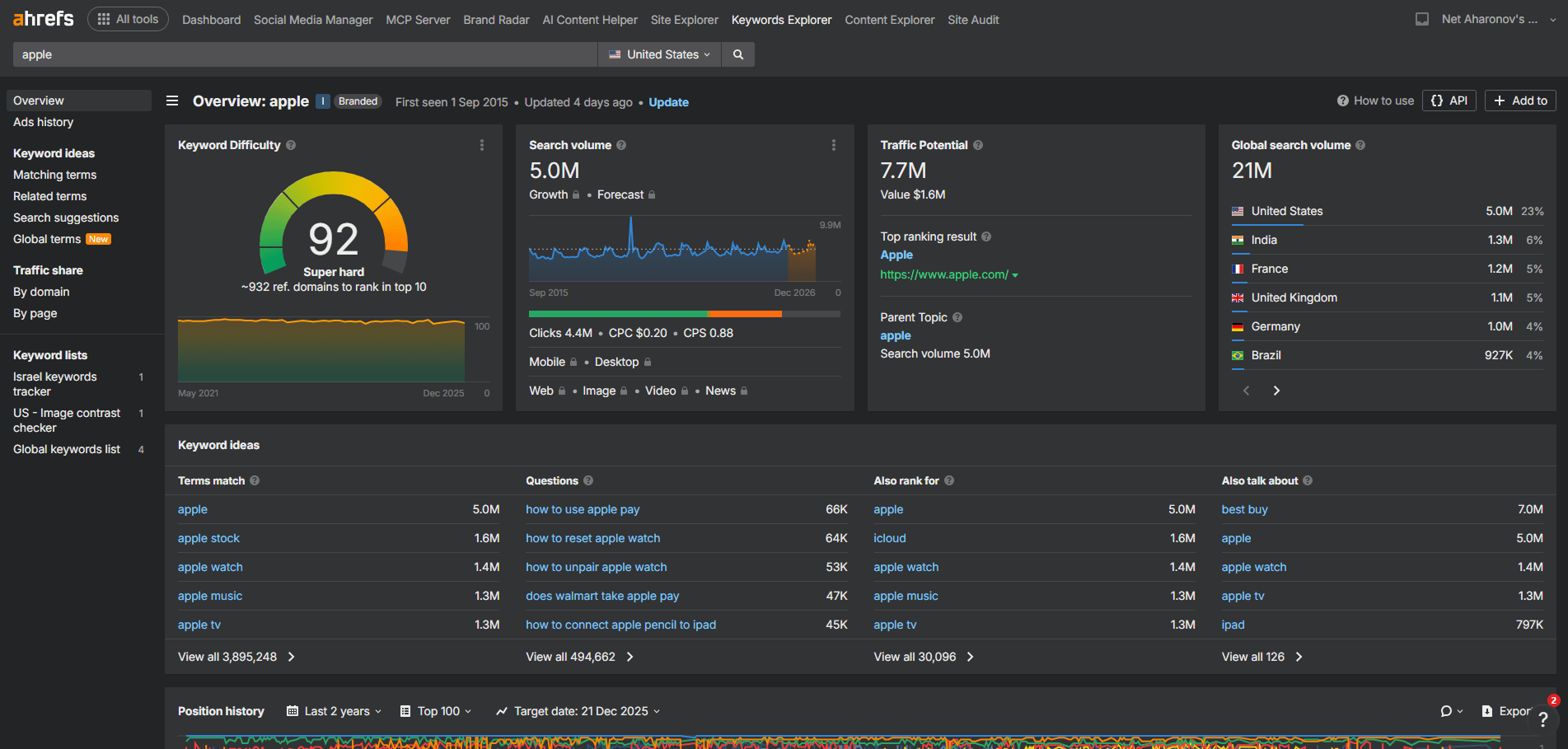
Quick summary
SaaS dashboards are one of the hardest types of interfaces to keep accessible. They evolve constantly, include dense data, and rely on complex interactions like filters, tables, and dynamic controls.
Ahrefs is a strong example of a SaaS platform that manages this complexity while maintaining accessibility, not just on desktop, but on mobile as well.
What this example does well
- Keyboard navigation follows a clear and predictable flow across the dashboard
- Controls, filters, and data tables are labeled consistently
- Focus states are visible and easy to track during navigation
- The interface stays structured even as features are added over time
- Accessibility is preserved on both desktop and mobile views
Many SaaS dashboards either break on mobile or block access entirely. This platform avoids that by keeping the experience usable across devices.
Why this matters
For SaaS teams, accessibility is rarely lost in one big change. It's usually small updates over time that break keyboard flow, labeling, or focus order.
This example shows that even a complex, data-heavy product can continue to grow without losing accessibility. Maintaining usable dashboards across desktop and mobile is critical, especially for teams that rely on their tools every day and don't always work from a desktop environment.
Public Sector and Government Website Example: GOV.UK
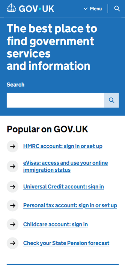
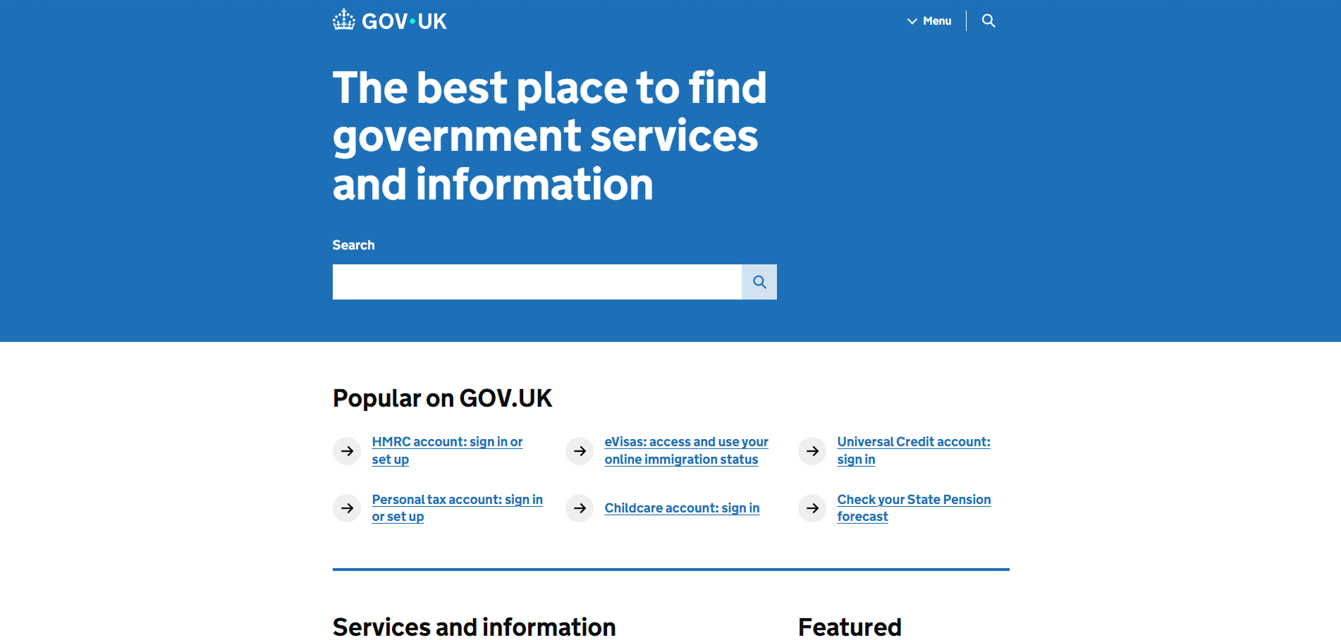
Quick summary
Public sector websites face a different kind of complexity. Not advanced UI, but scale. Large volumes of content, critical information, and services that must work for everyone. GOV.UK shows how a government platform can stay accessible by keeping the interface simple, predictable, and consistent over time.
What this example does well
- Clear page structure built around headings, links, and readable content
- Strong keyboard navigation across menus, search, and content lists
- Consistent link behavior and focus order throughout the site
- Accessible forms where required, without unnecessary complexity
- Clean, distraction-free layouts that work well with assistive technologies
Desktop and mobile accessibility
GOV.UK maintains the same accessibility standards on mobile. Content order, navigation, and interaction patterns remain consistent on smaller screens. This is especially important for users who rely on mobile devices to access government services.
Why this matters
Many public sector sites are text-heavy by nature. When structure or navigation breaks, users get lost quickly. GOV.UK proves that accessibility is not about visuals or advanced features, but about clarity and consistency. It's a strong example of how accessibility can be maintained long-term, even as content grows and changes.
Content and Media Website Example: NYT Cooking
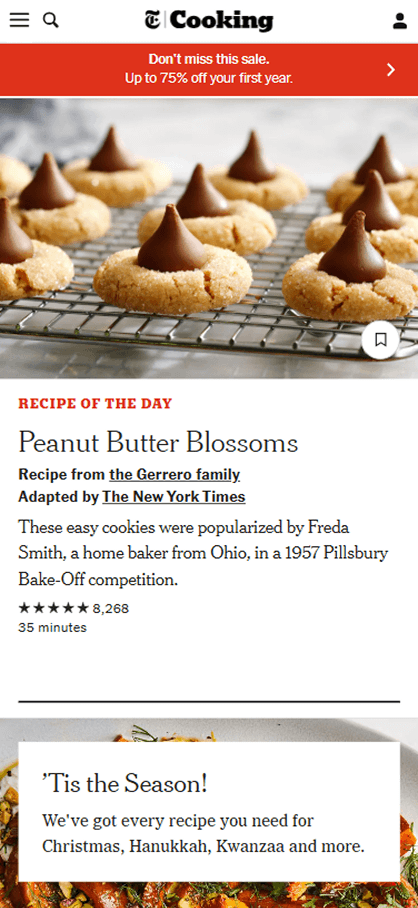
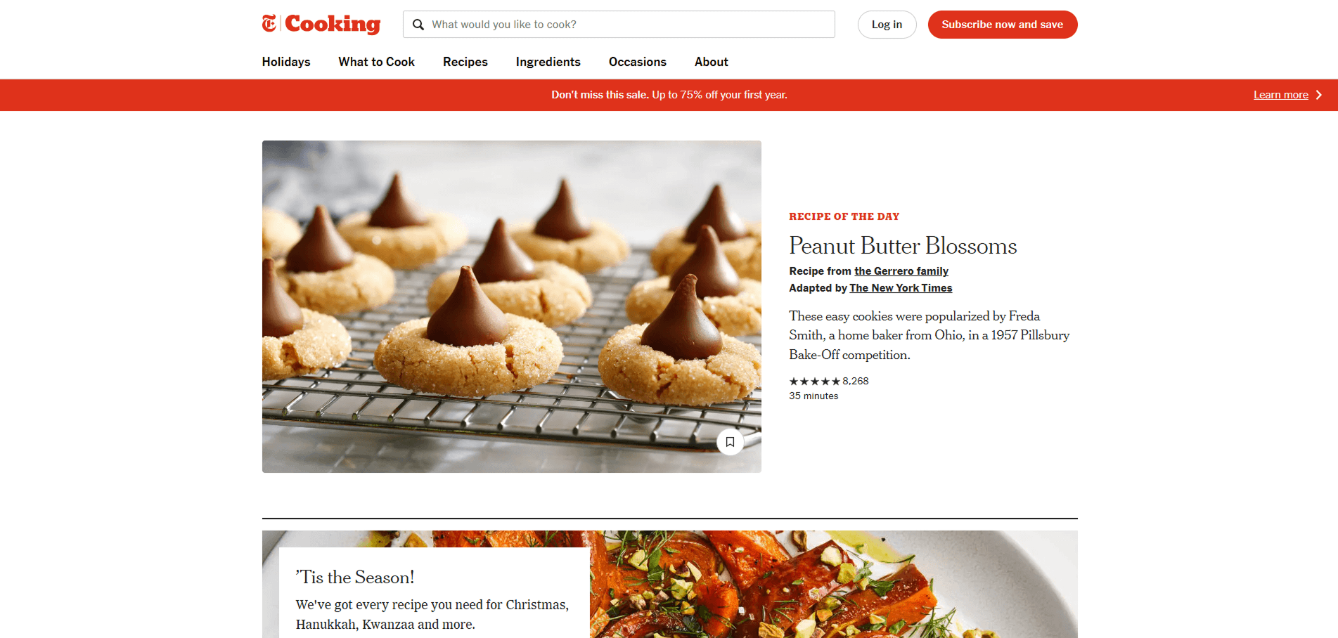
Quick summary
Content and media websites live on mobile. Most readers arrive on their phones, scroll quickly, and come back later. NYT Cooking is a strong example of a content platform that clearly prioritizes mobile access while keeping the full experience accessible on desktop as well.
We chose a recipe page because it combines reading, images, and actions. That mix often causes accessibility issues when not handled carefully.
What this example does well
- Clear heading structure that supports long-form reading
- Strong contrast and readable text across devices
- Images paired with proper alt text, including longer descriptions when needed
- Long image descriptions are connected using accessible labels, not overloaded alt attributes
- Interactive elements like save, ratings, and navigation remain keyboard accessible
- The same accessible structure is preserved on both desktop and mobile
Instead of cutting features on mobile, the experience stays complete and usable.
Why this matters
For content-heavy sites, accessibility is about clarity and continuity. Readers need to understand images, follow the content flow, and interact without barriers, especially on mobile.
This example shows how thoughtful use of alt text, extended descriptions, and consistent structure makes rich content accessible. When media sites get this right, more people can read, engage, and return, no matter how they access the page.
Marketing and Brand Website Example: Coca-Cola

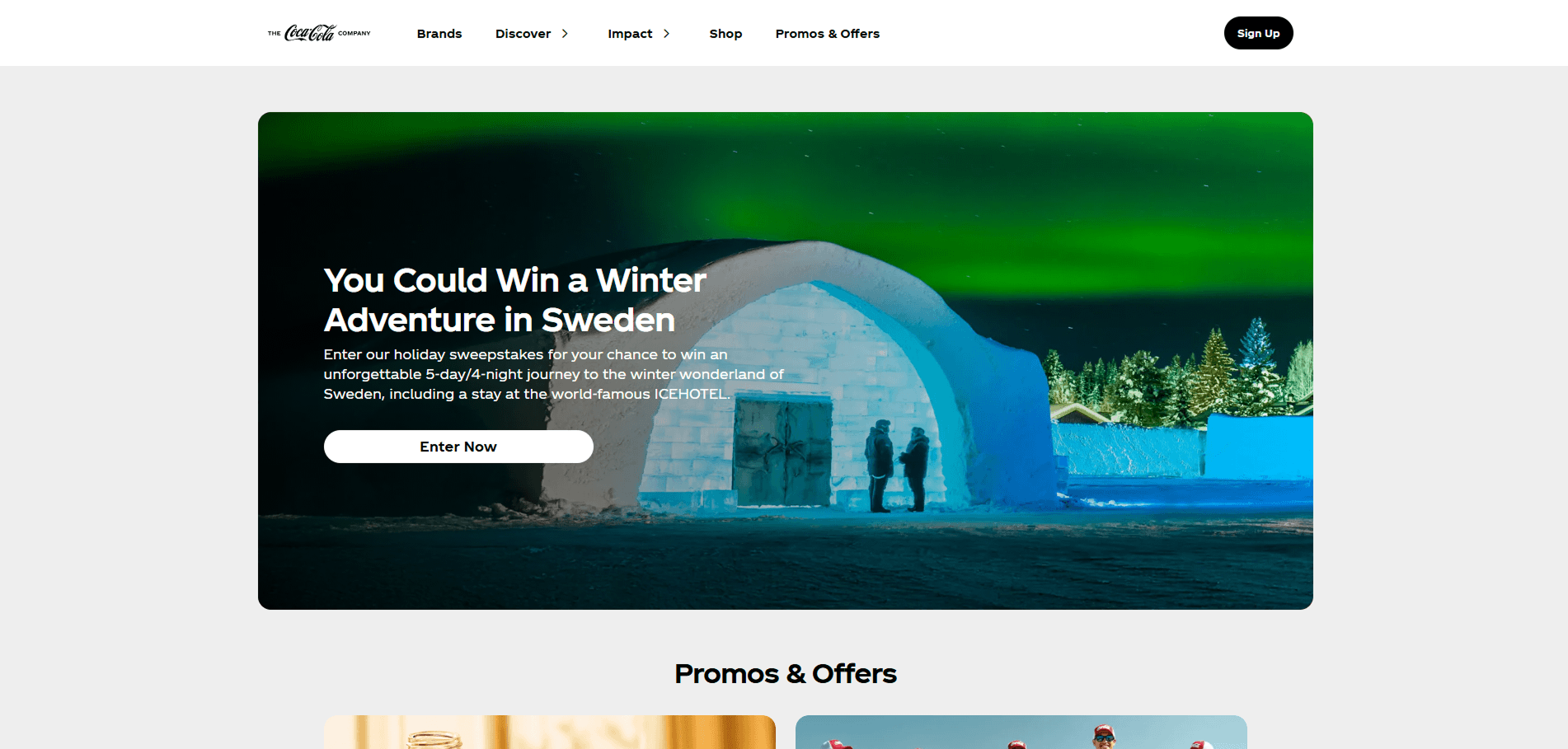
Quick summary
Coca-Cola's website serves a large number of visitors seeking information about the brand, collaboration opportunities, and product updates. Despite the high traffic, the site maintains a simple yet effective accessible design, ensuring that the experience remains consistent across both desktop and mobile views.
What this example does well
- Simple, predictable navigation across all pages.
- Clear content layout with well-structured headings.
- Accessible forms and easy-to-use feedback options.
- Mobile version maintains the same accessibility standards as desktop.
- Consistent call-to-action buttons and links across devices.
Why this matters
For marketing websites, accessibility helps build trust and keeps the user experience smooth. Coca-Cola proves that even high-traffic, content-heavy sites can stay accessible, making sure all visitors have an easy, consistent journey regardless of how they access the site.
ADA Compliant Website Examples: Common Issues We Excluded
While putting together these ADA compliant website examples, we tested plenty of sites that did not meet accessibility requirements. We didn't include those weaker sites in this blog.
What stood out is that the same problems kept showing up across different industries. The list below is a quick summary of the most common issues we saw on inaccessible websites, so you know what to watch for when evaluating your own site.
- Keyboard navigation doesn't fully work
- Headings and page structure are confusing
- Forms are hard to complete or give unclear errors
- Desktop and mobile behave differently in key flows
- Accessibility is treated as an add-on instead of part of the build
How to Evaluate Your Own Website for Accessibility
If you want your site to meet the same standard as these ADA compliant website examples, the first step is understanding how accessibility is evaluated.
There are generally two ways to do this. One is using automated testing, which helps scan pages for common issues at scale. The other is manual testing, which focuses on real user interaction, like keyboard use, screen readers, and completing key tasks. In practice, combining both usually gives the clearest picture.
If you want to go deeper into how these approaches work and when to use each one, we cover this in more detail in our ada compliance audit blog. It walks through what to test, how audits are performed, and how to use the results effectively.
Accessibility, Visibility, and Long-Term Value
When a website is built to be accessible, the benefits usually go beyond compliance. Clear structure and a logical flow don't just help users, they also make it easier for search engines and AI systems to understand what your pages are about.
When content is easier to follow, it's more likely to be surfaced, referenced, and connected to your brand over time. In many cases, accessibility ends up supporting visibility, trust, and long-term reach in ways people don't always expect.
Final Thoughts
If you're not sure where your site stands today, starting with a quick check can be helpful. The tabnav free accessibility checker gives you an initial view of potential accessibility issues and areas to review.
ADA compliant website examples aren't about tools, badges, or labels. They show what happens when a site is designed clearly and built with real users in mind.
When accessibility is part of the foundation, websites are easier to use, easier to maintain, and less risky over time. Use the examples above as a reference, then apply the same principles to your own site in a way that fits how your users actually interact with it.

You might also like...