Comprehensive Guide to Accessible Forms
August 5, 2024 - Guides & Resources
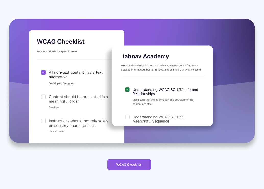
Making Online Forms Work for Everyone: A Practical Approach
Forms are a fundamental part of online interactions, whether it’s for signing up for newsletters, completing purchases, or submitting inquiries. Ensuring that these forms are accessible isn’t just about meeting legal requirements like WCAG compliance—it’s about creating a seamless experience for all users, including those with disabilities. Accessible forms allow every visitor, regardless of their abilities, to engage with your website effortlessly, enhancing user satisfaction and expanding your reach.
In this blog, we’ll walk you through the essential steps to make your forms fully accessible. You’ll learn how to check contrast, ensure smooth keyboard navigation, create clear and descriptive labels, provide helpful error messages, and verify the logical focus order of form fields. We also provide good and bad examples of forms' keyboard navigation in real time, with guidance and explanations so you can understand how to implement these practices effectively.
5 Essential Keys to Making Your Forms Accessible
Creating accessible forms is essential for building an inclusive online experience. To ensure all users, including those with disabilities, can effectively interact with your forms, it’s crucial to evaluate and improve specific elements. Below are five key areas to focus on that will help you make your forms more accessible and user-friendly:
-
Check Contrast
Ensuring proper contrast between text and background is vital for readability. Use free tools like the WAVE Accessibility Tool or the WebAIM Contrast Checker to verify contrast ratios. Additionally, the ColorPick Eyedropper extension helps manually pick and test colors, especially when background images are involved.
For more detailed guidance, visit tabnav academy's section on “Understanding WCAG SC 1.4.3 Contrast (Minimum)”.
-
Test Keyboard Navigation
Your forms should be fully navigable using only the keyboard. Users should be able to move between input fields, select checkboxes, and submit the form without using a mouse. This is crucial for users with motor disabilities who rely on keyboard navigation. Make sure there are no "keyboard traps" where a user gets stuck in an element and cannot navigate away.
For more detailed guidance, visit tabnav academy's section on “Understanding WCAG SC 2.1.2 No Keyboard Trap".
-
Ensure Clear and Descriptive Labels
Each input field should have a clear and descriptive label that is programmatically associated with the field. This helps screen reader users understand what information is being requested. Placeholder text should not be used as a substitute for labels, as it may not be read by assistive technologies.
-
Provide Error Identification and Suggestions
When a user submits a form with errors, those errors should be clearly identified, and guidance should be provided to correct them. Error messages should be specific, and the corresponding input fields should be highlighted. Additionally, the focus should automatically move to the first input field with an error, starting from the top of the form. This ensures that users can quickly identify and correct mistakes without unnecessary frustration. Make sure that screen readers announce these errors so that users with visual impairments can understand what needs to be fixed.
-
Verify Focus Order
The order in which users navigate through the form fields using the keyboard should be logical and intuitive. The focus should move sequentially through the form, ensuring a smooth experience for users who rely on the keyboard. This includes making sure that any pop-ups or modal dialogues triggered by the form are easily accessible and that focus is managed properly when these elements appear and disappear.
Testing Keyboard Navigation Order in Forms
Testing the keyboard navigation order in forms is crucial for ensuring an accessible and user-friendly experience. In this section, we’ll guide you through a simple three-step process to test the focus order of your forms. Plus, we’ve provided real-time examples that you can interact with to see the impact of correct and incorrect focus orders firsthand:
-
Start the Test
Begin by clicking on the title or the first element above the form. This ensures that the initial focus is set correctly at the beginning of the form. Starting from the title or a known element gives you a clear starting point to track how the focus moves through the form fields, helping you identify any potential issues in the navigation order right from the start.
-
Navigate Forward
After setting the focus at the start, use the Tab key to move forward through the form fields. As you do this, observe how the focus shifts from one input field to the next. Pay close attention to whether the focus follows a logical sequence—typically moving from the top of the form to the bottom, field by field. If the focus skips fields or jumps around unexpectedly, it indicates a problem with the form’s navigation order, which can confuse users and hinder accessibility.
-
Navigate Backward
Now, use the Shift + Tab keys to move backward through the form fields. This step is crucial because users should be able to navigate in both directions smoothly. As you move backward, check that the focus returns logically to the previous inputs without skipping any fields. This ensures that users who need to go back to correct information can do so without difficulty, maintaining a smooth and accessible experience.
How to Fix Focus Order Issues
If you’ve identified that your form has an incorrect focus order, fixing it is essential to ensure that users can navigate your form without confusion or disruption. Here's how you can correct focus order issues:
Free Website Accessibility Scan
Enter your website URL to get a free, instant accessibility scan with tabnav's checker.

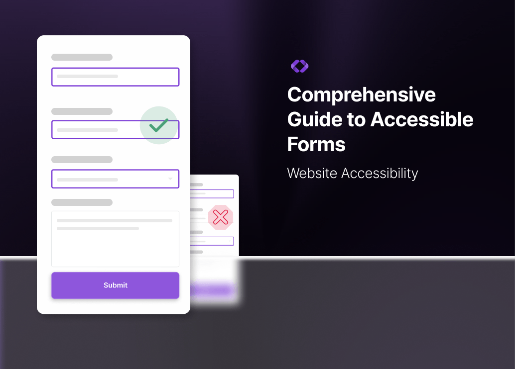
Essential Form Validation Tips for Better Web Accessibility
Form validation is essential for ensuring that users provide the necessary information accurately and efficiently. Effective validation not only maintains data integrity but also significantly improves the user experience, especially for individuals with disabilities. In this section, we will delve into the critical aspects of accessible form validation and provide practical steps to test and optimize your forms for all users.
Key Elements of Accessible Form Validation
-
Clear Error Labels Indicating What Is Missing
Error labels must explicitly state what information is missing or incorrectly entered. Instead of vague messages like "Error" or "Invalid input," use specific descriptions such as "Email address is required" or "Password must be at least 8 characters." This clarity helps all users, including those with cognitive disabilities, understand exactly what needs to be corrected.
-
Error Messages Recognized by Screen Readers
Ensure that error messages are properly coded to be detected and announced by screen readers. Utilize ARIA (Accessible Rich Internet Applications) attributes like aria-live="assertive" to make sure that error messages are announced immediately when they appear. This real-time feedback is crucial for users with visual impairments, allowing them to quickly identify and address issues without confusion.
-
Focus Management Directing to the Relevant Input
When an error occurs, the focus should automatically move to the first input field with an error. This assists users who rely on screen readers by directing them to the exact location that needs attention, minimizing frustration and streamlining the correction process. Proper focus management ensures a smooth and efficient user experience, enabling users to navigate and fix errors with ease.
Testing Form Validation
To ensure that your form validation is accessible, follow these three testing steps on the form validation example provided below. This example demonstrates how accessible form validation should work, and the instructions below will guide you through the process of testing its effectiveness.
-
Click Submit to See the Error Messages
Start by attempting to submit the form without filling in any fields. Observe the error messages that appear. Ensure that each message clearly indicates what information is missing or incorrect, providing specific guidance on how to fix the issue. This helps users understand exactly what needs to be addressed before proceeding.
-
Fill Out the Bottom Form Inputs and Leave Others Empty
Populate some fields, particularly those at the bottom of the form, while leaving others empty. Then click submit and observe how the focus is directed. The focus should return to the first input with an error, typically starting from the top, to help users identify and correct the issues in a logical order. This ensures that users are guided through the form in a structured manner.
-
Verify Screen Reader Announcements and Keyboard Navigation
Use a screen reader to navigate through the form and trigger validation errors. Ensure that error messages are announced correctly and that the focus shifts to the appropriate input fields. Additionally, test keyboard navigation to make sure that users can easily move between fields and access error messages without relying on a mouse. This step confirms that both visual and non-visual users receive the necessary feedback to complete the form successfully.
Ensuring your forms are accessible is a vital step in creating an inclusive website. By following the best practices outlined above, you can help ensure that all users, regardless of their abilities, can interact with your website smoothly. At tabnav, we offer free guidance and assistance with forms and web accessibility. Feel free to contact us today with any questions, and let us help you make your website a more welcoming place for everyone.